Sunday 8 December 2013

Book proposal

For my book I want to do things we bribe children with. In my observations I saw quite a few families and found them the most interesting. I wanted to try and do something different this time, I have the idea to do this as a picture book with as little text as possible.

Possible layouts:

  • An ABC style book with the situation on one side and the corresponding illustration on the other
  • A story of why the child is bribed, how and what with 
  • Having the tantruming child on one side and the bribe on the other  
  • A counting style book with all the bribes (3 trips to the park, 10 pieces of chocolate etc.)
  • A collection of bribes
Reasons why children are bribed:
  • To behave in public 
  • So that the parents can try to avoid being judged and embarrassed  
  • The parent is just too tired to put up with the child's behaviour 
Where children are bribed:
  • Supermarkets
  • Walks
  • Cars/ car journeys 
  • Public transport
  • Formal occasions (weddings etc.)
  • Church
  • Family's houses and occasions 
  • Restaurants  

What children are bribed with:
  • Chocolate 
  • Santa
  • Ice cream
  • Toys
  • Trip (playground, park, seaside etc.)
  • Fast food (Mc donalds)
  • Technology (phones, tablet etc.)
  • Travel packs (special foods, games etc.)
  • special foods ( coco pops etc.)
Reasons why children are misbehaving:
  • Tired
  • Bored 
  • Has been  put in in something they don't want to wear 
  • They've been thwarted 
  • They've been  taken somewhere they don't want to be 
  • They want attention
Secondary research:


This blog does a lot of what I want to be doing with my book. It has the humour that I'd love to have come through in my book it also has a wealth of examples of children misbehaving.


This book is a wonderful description of what it feels like to put a child who doesn't want to. It perfectly encapsulates that feeling while presenting it beautifully as a normal children's book. I love the idea of doing a picture book that's aimed for adults.

First hand research:

This is my son Oliver and some reference images of him being grumpy, crying and being bribed.


He was angry because I wanted to take a photo of him in his onesie while it still fitted.


He was sad because we put him in his snow suit and there wasn't any snow left.


He was sad (from running too fast and falling over) until I told him we can send these photo's to my sister.


I told him that he could have his pom bears after we took a photo of his back pack.


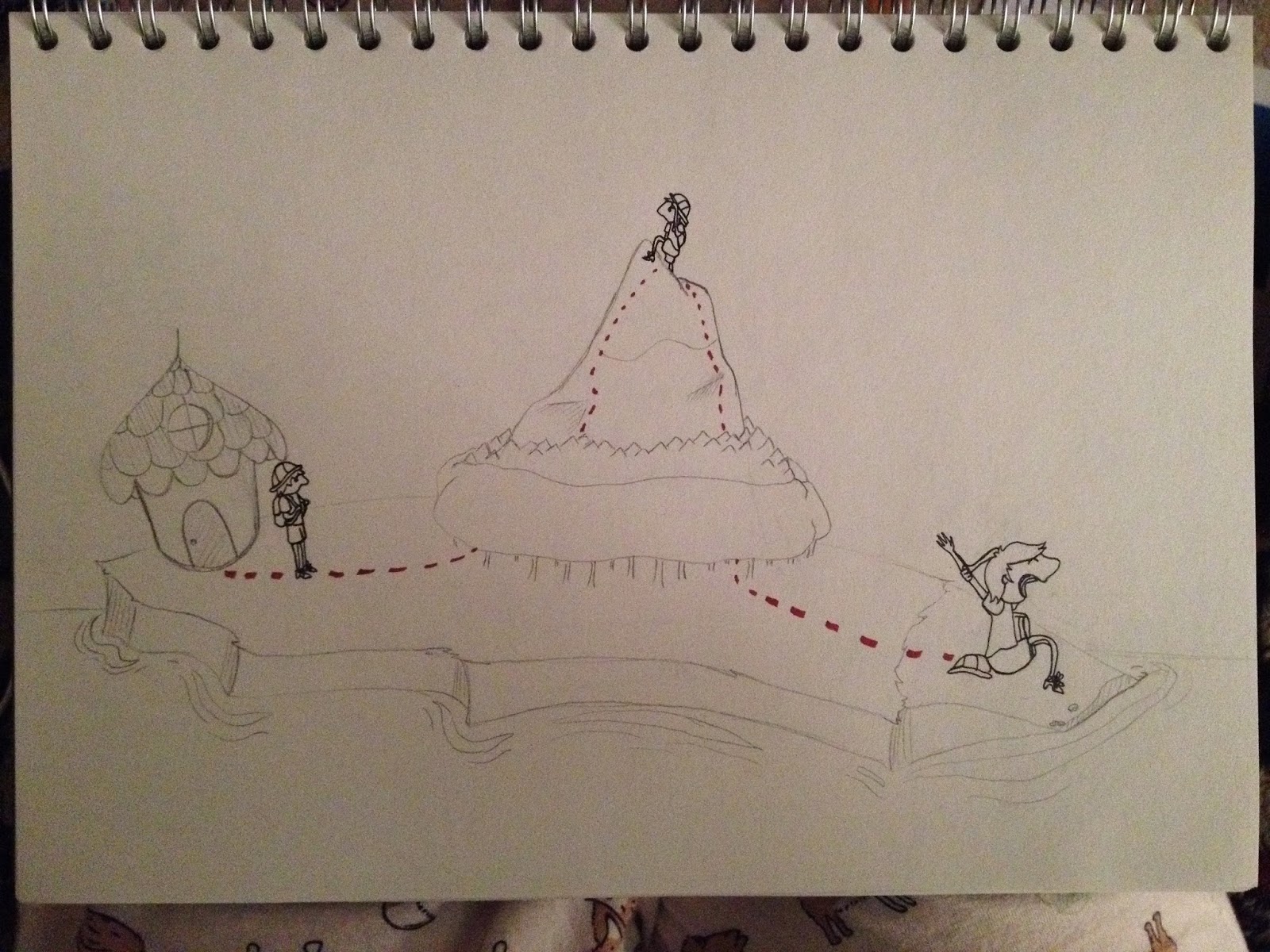
After we got lost and the walk was considerably longer I had to point out check points where he could have a piece of chocolate in order to persuade him to continue.


He was angry because I wanted to take a photo before I gave him his piece of chocolate.


Thursday 14 November 2013

A matter of opinion

In this brief we given the option to choose one of fourteen quotes and illustrate it. I chose "A drawing is simply a line going for a walk". I knew straight away that I wanted to take it quite literally and draw a child going for a walk. I wanted to draw the child as a continuous line to really emphasise the fact that it's a line going for a walk. I thought that the child should remain very two dimensional so I knew it was necessary to get the face right, especially as a side on faces are a weakness of mine.I feel that I got better at drawing the face for these and that they worked much better to exagerate the noses. I also did an early colour test with a copic and  decided that I didn't want to use them at all for this brief. One of the ideas I liked was to draw the character with an explorers hat to show how for a child a walk can be an adventure. I also drew some roughs of places he could be.


After settling on the boy I did some colour tests, none of which went incredibly well due to my lack of skill and experience. I tried to do some coloured pencil ones to really play up the childish aspects but it just ended up looking terrible. I need to further practice with these mediums to mainly get rid of the marks left behind and neatening up. In these colour tests you can see how I wanted for him to leave his line behind him to show that he's all one line. It gave me the idea to do a children's book with his entire journey mapped out.


I also did these two with the idea of really emphasising that he is a line. I also thought that I could simplify all three and slowly draw out the boy with each illustration. However I decided after this that I would keep the line separate from the character as to not confuse the three illustrations as one.  

I then did some experiments to show the line differently. The first one below is a mock up of how I would do it with thread and pins and the rest are a red dotted lines, the idea for them are both based on ways of showing travel on a map. Its from this that I moved more onto the island and completely separating my illustrations. Keeping them separate was the main trouble I had with this brief as I wanted to show his progression in his journey.I really love the island design I think that its simplicity is what works best and on the island the house is my favourite, I think it's design is lovely because of oddness of it and how much potential it could have for a story. In the end I decided to do three separate squares with the three aspects of  the island on them and after talking to Matt I decided to try to use photoshop to colour them.


I did some Photoshop tests and really liked the paper texture overlaying it,, it stopped it being too flat but in order to keep the paper I couldn't adjust the levels and that made the lines too pale. I know there is a way to add the texture afterwards but I don't know how and this proves to me that I should continue to practice with Photoshop.


These below were my final pieces. One of the aspects that worked well in this is the shading it makes the whole drawing look a lot better than without. However I need to learn how to use Photoshop better, perhaps how to get the right brushes and play around with it. As I said these were my final pieces until in a moment of exhaustion I forgot to move the first two images from my user work folder and lost them. I had to redo them and because of that they ended up a little different. 


A day in the life

For this brief I was given an article and was told to choose three words that interest me. I chose future, young and conspiracist, after choosing the words we did a workshop where we played word association and passed it on to another person to do further associations. I originally found this fun but useless as it goes so far away from the article. However I found when doing my roughs that it really helped, it particularly  helped for props and background ideas. 

 I did some quick ideas with some colour before moving on to some more thumbnail type drawings. For all of my drawings I had Russia in mind after my chosen word, future Russia etc. and for future Russia  the robot babushka was further evolved and eventually became the final piece. I chose to continue with the robot babushka because it was my favourite design and because it was a sort of clash of ideas, with the traditional and the future. 


Here are my more thumbnail style sketches. These ones are for young Russia, my intention was to do a 20 something as the article refers. However after the word association encouraged me to do more of an obvious connection to being young. 


Future Russia was also explored with the help of the sheets and with my own ides of a more sci fi based drawing. I tried to include Russian landmarks into the drawings.


For Russian conspiracists I mainly tried to include the tinfoil hat as it is synonymous with conspiracists. I also used my own knowledge and some of the suggestions from the sheet.


The results of my concept crit, The main opinion was to draw more babushkas and perhaps some Russian nesting dolls.


I decided to try to use a dip pen for this brief, something I had tried in visual language. I wanted there to be colour still so I tried using watercolour, copics and coloured paper.


This is my favourite and first of the of my finals, I highly enjoyed doing the texture of the wood and the colour works the best. I chose to do a combination of lots of fine black line by the dip pen and bits of colour added with copic. I think it worked well and made a great contrast, which the coloured paper couldn't achieve. The idea behind this was from a word on one of the sheets, it shows the traditional being left behind by the young.

With both of these I found it much harder as the ink kept coming on to the page or getting smudged, fortunately  as it's the robot babushka it rather appears to be oil leaking from within it.


This is my conspiracist, I chose to do a babushka for this as well as I felt like it made a better set. To truly give the impression of her being a conspiracist she has the tin foil hat, aliens on her apron, lizard Putin on her broach and the bright blue to finish it.