In this module I've done a lot of theory behind the work which I never talked enough about on my blog. As I decided pretty early on that it was the characters that I love about the Discworld (and any Terry Pratchett) series, it was those that I focused on. However when I went back to reading some of the books and exerts from others I realised that Terry Pratchett hardly ever describes physical attributes. On the whole I think this is wonderful that its the character's personality and actions that make them over their appearance but when you're trying to show a character it can get a bit tricky. I've spent a lot time thinking about how Angua should show how beautiful and how classically she resembles the role for women in fantasy While also showing that regardless for how she looks she isn't that character. All the characters (or at least the ones I wanted to portray) had this combination of either little description or conflicting appearance to intangible qualities. This made it difficult but enjoyably so to design them. I've tried to sow a lot of it in body language and expressions. I hope this is visible to others.
I did most of this work in my visual journal but this led to me just having fun drawing lots of characters and not spending enough time continuing to develop the way I was working. Though I did enjoy it at the start and it reminded me that I do like working with collage and the effect it can create.
I have not enjoyed the moving pictures brief through mainly my own fault. I have learned that I am not an animator, I don't have the patience for the hand drawn animation that I love and I don't think in the way that you have to for stop motion. I think part of the trouble has been that I do love cartoons, I spend probably too much of my time watching cartoons. I would say that cartoons probably influence me and how I draw more than art galleries and even most illustrators. All of this is fine except when it comes to doing an animation because I constantly have the way I want to do things and my own inability and fatigue at drawing the same thing over and over again frustrate me to the point where I just don't want to be anywhere near it. However I think that I might have been more inclined to enjoy it if it hadn't been tied to the author brief. The fact that I had to keep thinking about how I had to convey Terry Pratchett/his work hindered my ability to just make things regardless of how it looks. Though yet again this is my fault for choosing a series of books that I love and want to do properly. I thought that while I do log it it wouldn't be too much of an issue as i was having no trouble with the drawing side but when it came to learning a new skill (which you're likely not to do well from the start) I found it incredibly aggravating to no be able to convey what I wanted. Saying all of that though I am glad that I've the learned the basics, its good to know that if I went back to it I wouldn't be completely lost and I agree that while I personally don't enjoy it, it is a useful skill for illustrators to at least understand how animation works. I have also gained a massive respect for animators. It should also be said that as I had the option of doing the work I understood and liked more I did ignore animation and some of my stress towards it is likely to be from that.
For all my negativity towards animation and this module on the whole I am pleased with my printed pictures. While my work may not have that much technical skill, I got to expand on my ability to interpret characters and as books are what I'd like to go into learning how to make them relatively easily and on mass has been invaluable. From this moderately simple process of making a hotdog book I have managed to get my work to a slightly higher standard, its still not perfect or professional yet but making it into a book has meant that its got a bit closer to something I struggle with. I've really enjoyed getting to screen print again especially as its something you need to be doing regularly to remember what to do. however it is a very long and process which was made longer for me as someone stole my screen after I had left the emulsion to dry. but I hindered myself as well when I didn't put enough time into making sure my lines were thick enough and had to start my screen all over again.
I'd quickly like to say as well that I let things that bothered me that had nothing to do with college effect how I was working and how well I handled this stress of this brief which was not well at all. I let both my emotional state and my necessity of needing somewhere to live urgently effect how much time and effort I was putting in. I can't promise that I won't do this again as I was trying this time but I think I can do better in the future.
I don't know where this should be but I would like to say that its been lovely the way that everyone has been helping each other through trying to do things they probably haven't done before.
Tuesday, 20 January 2015


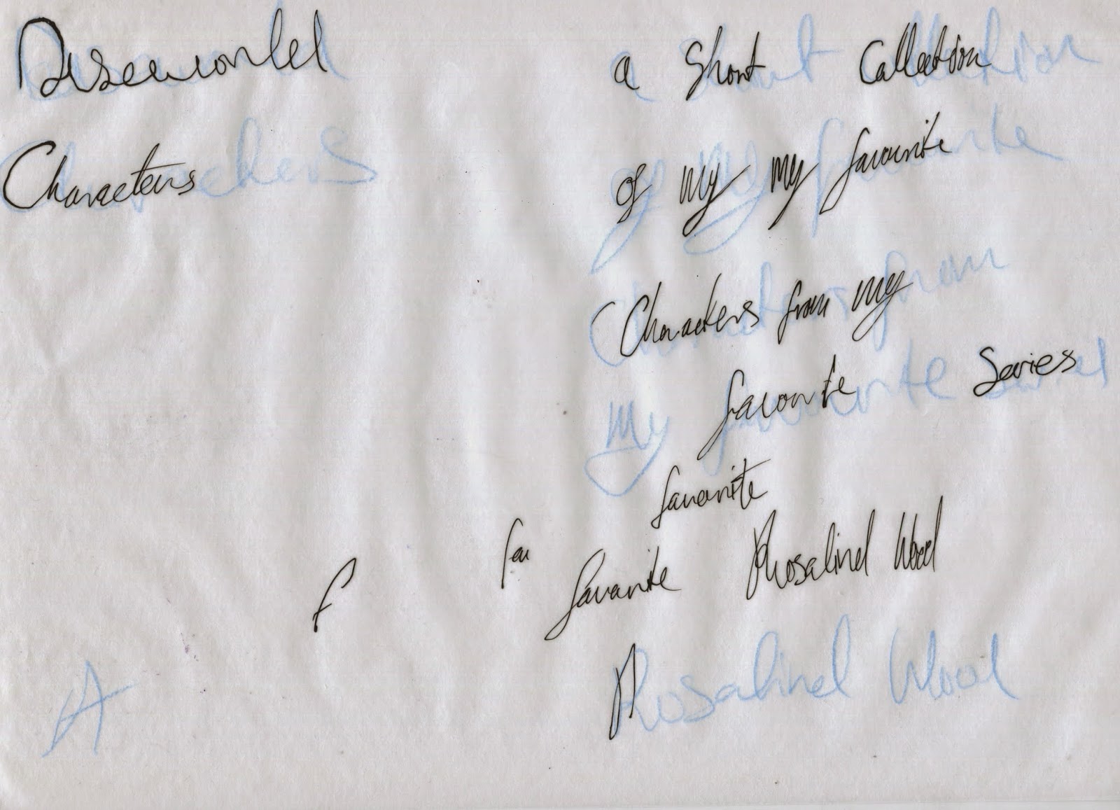
Printed Pictures Finals
These are my final books and I'm pretty pleased with how they came out and how I managed to get them into book form. unfortunately as its printed on cartridge some of the folds are a bit thick but I couldn't print on anything thinner as it would have either not worked or would have lowered the quality of the print. I' really glad I've learnt this method as I was able to quickly and easily (if tediously) make lots of little books, which I feel will be useful for me in the future.
If you can't see anything here wait a little bit as it takes a while to load
Young Sam final animation
young sam smoke from Rosalind Wood on Vimeo.
I think this one is probably the smoothest as I did it last and had a better idea of what to do. However I also think it looks the flattest as his eyes move but his mouth stays constant.Sybil final animation
Sybil from Rosalind Wood on Vimeo.
I think this one is is my favourite as the drawing worked better with how I animated.Sam final animation
Sam from Rosalind Wood on Vimeo.
I think the audio on this one is a little quite but I do like how I was able to match his blinking to it. I seem to have not been able to match up the blinks very well to the rest of it as the image moves when he blinks but I'm still pretty happy as it's my first at making any drawing move. I got better at this later. I also think that some of the quality was lost when putting it through vimeo.Screenprinting
When I exposed my screen I must have done something wrong as there is a section on the frame of vetinari (he has a crossword) which would never fully let the paint through. I also think that I mustn't have had enough medium in my green prints as none of them came out as well as either the blue or the red. I think that by the time I did the red ones I knew what I was doing, it was a combination of that and a better medium to paint ration that meant the red ones are consistently better than the rest. It was while I was doing the red ones that Orlaith suggested that I overlay some of the green ones. This worked really well and are now some of my favourites and give the impression of being 3D.
Storyboard
These are the storyboards I did for my animations. they show what stays constant (blue), what moves (pencil) and what I would do if had more time to work on it (yellow). with the yellow I say how with the man I'd show his cigar light up and glow, with the child I show the dragons arms move and with the woman I'd have the fire behind her glow. If I was an actual animator I would show the man tickle the dragon to release the fire that lights his cigar, I would show the boy squeezing the dragon and the smoke coming out in wheezes and coughs, I would show the dragon around the woman's shoulders lift his head and slowly blow some smoke out.
Test booklet
This shows the two different test booklets I made. this is because When I came to screen printing my original work was too small and needed scaling up and once that was done I had to test that it would still work as a hot dog book. In these you see how I want the book to work.
Monday, 19 January 2015
Text
This is two examples of how many times and how many different pens/pencils I used to try and get the right text for my book. I stingily felt that I should be the one to write it even though my handwriting is terrible. I thought that as I've made the whole book in a way that I'll be able to do it again in the future I do't want to rely on someone else that i may not be able to rely on again.

The print I would have done
If I had the time to develop this I would have also made this as an extra three layer A3 sized Print. It's a family portrait of the Vimes' which would nicely have tied the solo frames of my book to the family of my animation. However between the amount of work I already have to do and finding/moving into a new house has meant that this isn't feasible.


Friday, 9 January 2015
Hot dog book
This is the plan for the hotdog book all laid out ready for screen printing. I've done them in this order as I think that Susan and Adora Belle (the two with their hair up) are very similar characters, Angua and captain carrot belong together (as a couple) and while Sam and Sybil are married I think that his and vetinaris dynamic is better. I also felt that sybil was on of my strongest characters who belonged on the front cover.

Yong sam and background
Here he is place over the background. Like the rest I've placed him slightly to the right to levee room for the smoke. I've had to reverse him as he would have covered up too much on the other side as well as being the anomaly in the group. This was just a stupid error that I could have not had if I had thought about it more when I was originally drawing them instead I only realised when I placed it in the background and had to spend time changing all the shadows I had placed as they now clashed.

Young sam
I'm very happy with the actual drawing of this as I think its shows how a small child/toddler looks,acts and reacts. However I'm not happy with how I drew his clothes as they also seem too modern. I also like the dragon in this, he's the only one with his eyes and I had fun with how bright they could be compared to the rest of the dragon. I've also made sure that all of the dragons are different to try and show how its not just this one pet that they have, its the whole brood of them that Sybil rears.

Young sam's room
This is young sam's background, I drew it as his bedroom as (it's most likely where he would be) there is a dragon (without fire) that sleeps under his bed. I thought this would be the most natural place for young sam to be playing with a dragon. I also included the book wheres my cow in the bottom lefthand corner, which has a large part in the book Thud (another one of my favourites). However aside from this I'm not happy with this as I think it looks too modern, though I'm not sure what I could do about that as in the series there is often bleed from current time as well as question as to if its victorian or medieval.

Sam's dragon colour
As you can see when it came to putting him against the background I wasn't so sure about the bright red. I tried a few different colours these three being my favourite and eventually decided on a slightly more intense orange than you see below as it went better with the painting and still stood out.

Sam
This is the Sam I drew for the animation and like sybil the lines were pretty simple as I'd drawn him a few times before. The colouring was also pretty simple as he's wearing his watch uniform (without the breast plate) which is described in the book and I thought the dragon should be different to the other one so I did as a bright red to go against all the brown.

Sams background
This is Sam Vimes' background I thought it would be most appropriate to show his office, as it's where he's most often described in the books. After the end of Guards Guards the watch station was donated by Sybil and used to be the house she grew up in. from this I reasoned that it would likely have the same aristocratic roots. I chose the colours and the cow/horse painting from there. I also included his in and out tray as they are mentioned in the books. However I am considerably less happy with this one as I don't think I put enough effort into the painting and I don't like the way that its all just floating against the green wall.

Sybil and background
As you can see the dragon I coloured with Sybil made all of the Sybil layer look faded and washed out so I changed it to a more vibrant green to go better with the background.

This is her placed where I want her for the animation with room to the left for the smoke.

Sybil
This is the Sybil I drew for the foreground I think she's a success as I've already drawn her so many times and the early photoshop experiments meant that I already knew how I wanted it to be coloured. I hadn't coloured a dragon before but I did it to a tone that would match sybil while also contrasting with all the reds.

Sybil's background

This is the final version of the background for Sybil's animation. I've based all my animations on the Vimes family (my favourite characters from discworld, as well as keeping all three in a theme). This background is based on my interpertation of sybil's house, as she's described as being from a aristocratic family and for family having many hunting trophies I've tried to include these. Its based on both m overall idea of a safely home (from many years of visiting them) and quite a few different images of similar rooms. The colour scheme is the same, a lot of it is based on my childhood visits and various images to back my memory up. I am really pleased with this illustration but I should have remembered to put soot in the fireplace and drawn the fire in a more animation friendly way. My biggest failure on this however is when I accidentally saved it in a merged format meaning that I couldn't change anything without potentially ruining the rest. I would say that next time I won't do this but I'm sure I'll be tired and carless again.
Thursday, 8 January 2015
Animation line work
Here I took the ideas from my initial drawings and characters from my earlier work and drew them out with a dip pen to create better line quality. However as I wasn't careful enough some of them are a little smudged or have similar errors but I will be able to fix that in photoshop.
Backgrounds initial drawings
These are my initial sketches for my animation backgrounds. As you can see I originally wanted to keep the frames from printed pictures to keep the theme but I decided as it would take up too much of the space that I should do them without frames.


Subscribe to:
Comments (Atom)