Thursday, 14 May 2015
Wednesday, 13 May 2015
Full book including storyboard
This is my full book including the pages I had storyboarded. I think it works well and I would really like to finish the entire book at some point. However seeing it full has made me realise that it looks a bit like she commits suicide. I don't really know what I can do about this right now except to remind myself that Tiff is shown standing on a star so maybe it won't be the thing people think of.
Presentation boards base

This is the base I made for my presentation boards, the pattern is made from the colour variations of tiff. I think it's a little garish for me but I do quite like it for the book and if I had more time I could have mocked up some notebooks with this pattern.
Tuesday, 12 May 2015
Mockups
These are all the mockups I made I think the Ipad/phone ones are best as the show the book the best but I also think the T-shirts worked quite well. However I really don't like the mug it was a lot harder to do than I expected and the template I was working from wouldn't let me change the colour of the mug so I think it looks shoddy. I'll have to spend more time practicing if I want to mock up a mug in the future.
Stickers

I've designed some stickers to go with my book or rather I collected my favourites from my coloured pages to make a sticker sheet. I'm very excited about these as I've never made stickers before.
Moon

I added a moon to my front cover as I thought it tied it in a bit better with the rest of the book.
Mockups


These are the first mock ups I've ever done and I'm very pleased with them. I found a website that provides free templates so I only had to put my work on them which was a lot more manageable than fully creating the mock up. for these I took a screenshot of my book issuu so it'd have the same digital bend of the pages that an e-book would.
Wrap around cover
At first I tried using the map as the front cover Like I had imagined. I though it'd look really good at an angle with it folding over onto the back cover as well but in practicality it was just awkward and wrong. I also tried it as the full cover but as I wanted the girl and tiff on the cover it also didn't work. It did work better without the map background but it was still too busy so I went away and looked at some book covers. I saw one with a circle in the centre and it inspired me to make my chosen cover. I tried using flying eye books as the proposed publisher, I got their logo and looked at some of their books (all of them had the name at the bottom of the front cover and the logo on the back). I don't think it works as well though so I also tried walker books which I think fit in perfectly. I tried a few different colours for the cover but I ended up with the one I liked first as I think it compliments the characters best.
Map
I finally got the perspective to make sense. I also created one with colour and texture to use for the front cover, though I was thinking of using the mono one as end pages. I made an alternative one with lines but I think it makes it look too busy and the black fill isn't perfect but it's the closest I've got to what I had in mind. Next time I think I'll do it all with a dip pen and ink, including the fill.
Tiff gif

My notes on it.

What happened when we tried to liquify it.
After going over and seeing paul's animation he tried to show me how to make one too. It didn't really work very well but I do like what came out of it and it made me happier to try gifs again in the future.
Cliff
Now that I've coloured my characters its super quick to colour her again. For the sky I started with the colour from the moonlight sky and kept lightening it as I went down. After Eleanor said she couldn't tell wat was happening with her face I tried amending it but it just didn't work at all, so for next tiem I'll have to make sure not to draw her mouth so weird.
Moonlight

Here is the moonlight page with Tiff in as well. I think he adds a lot and he fills a space that was a little blank before. unfortunately as he was added later I had to twist him a bit for him to look at her and I think it looks a little unnatural.
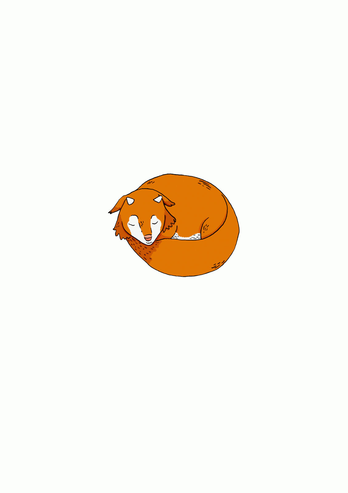
Tiff
I digitally coloured my creature character, while I did play with some other colours I ended up choosing similar colors to the original. Everyone still thinks he's a fox. I drew the two new ones for my moonlight page the better one is to go on the page with the girl and the other less detailed one is for the text page. I really like the one I did for the moonlight page and I think those little lines that that one has really make a difference, particularly as I then shade under the lines which add a little extra definition. I also named him Tiff after the name of the files that my scans kept coming up as, I mainly just thought it suited him.
Sandwich

This is by far my favourite, it has very satisfyingly worked exactly how I wanted it to. I'm sure the perspective is wrong in places or entirely but it doesn't really detract from the drawing. I think that this has worked so well because of the shading, particularly the overlapping shadows.
Coat
After I finished the stars i moved on to the coat page. I tried using a texture in this one as well (the lining of my coat, which is the same as hers) but it just looks like a photograph on top of a drawing which I really don't like. I'll need to spend more time learning how to that properly before I try again. I also looked into changing the background colour to more of a beige like where's my hat but it looked too much like the sandwich and besides I think I'd prefer it to get its colour from the paper its printed on rather than printing a beige colour onto an already kind of beige paper.
Moonlight progression
I did try using a texture for the stars once though, this one is from a photo I took of mould growing in my old house that I thought would make a good starry sky. It does make a good starry sky but I think its too busy to go with the rest of the book so I've made the stars how I normally would. I also tried to make a gradient for it but that ended up being more complicated than I thought ,particularly with how I had made the stars. I think if I'm going to do a gradient I need to make sure I have the time to actually learn how to use it correctly.
Texture
I made these textures to use in my book. I was mainly thinking for the stars and how to make it more magical but my lack of skill with wet media made them subpar and I didn't like the idea of having some of them with texture in and the other pages without.
Kitchen
As I mentioned earlier perspective is not my friend. I wanted to show her preparing her supplies for her walk, like the coat drawing says,but I found it incredibly difficult to actually draw the kitchen she's meant to be stood in. I hardly ever draw backgrounds for my illustrations as I like to keep them simple but surprisingly not drawing backgrounds often has made it a lot harder and more time consuming to do the backgrounds than it should be. One of these is even based of my kitchen at home but my kitchen is too small to work right for this.
Linework
I made some more finished linework based off the newest storyboard. I'm most proud of the sandwich as I wasn't sure how the layered effect would work but I think it makes it look a lot stronger. I'm least proud of the rained on girl as I think she lacks who she is compared to the other drawings but then it would make sense for a drenched girl to feel a little flat.
Storyboard
This is my new storyboard I made with the layout in mind. I realised my favourite books had smaller, less detailed illustrations on the side where the text is, so I decided to try to do that for my book. some of the pages in this are alternate versions of the same part as some of them needed more amending than others. I have however managed to draw the creature character in more of these than I did in the previous storyboard.
Book layout research
As I had got excited about the other pages, I realised that I wasn't sure about how I wanted my book to be and what layout it'll have. So I looked at my collection of favourite children's books to research how they've laid out their books.
Initial colouring


This is the initial colouring and so far I think its working really well and I'm excited to do the others, however I've not tried the background yet and that is where it'll get difficult.
Subscribe to:
Comments (Atom)