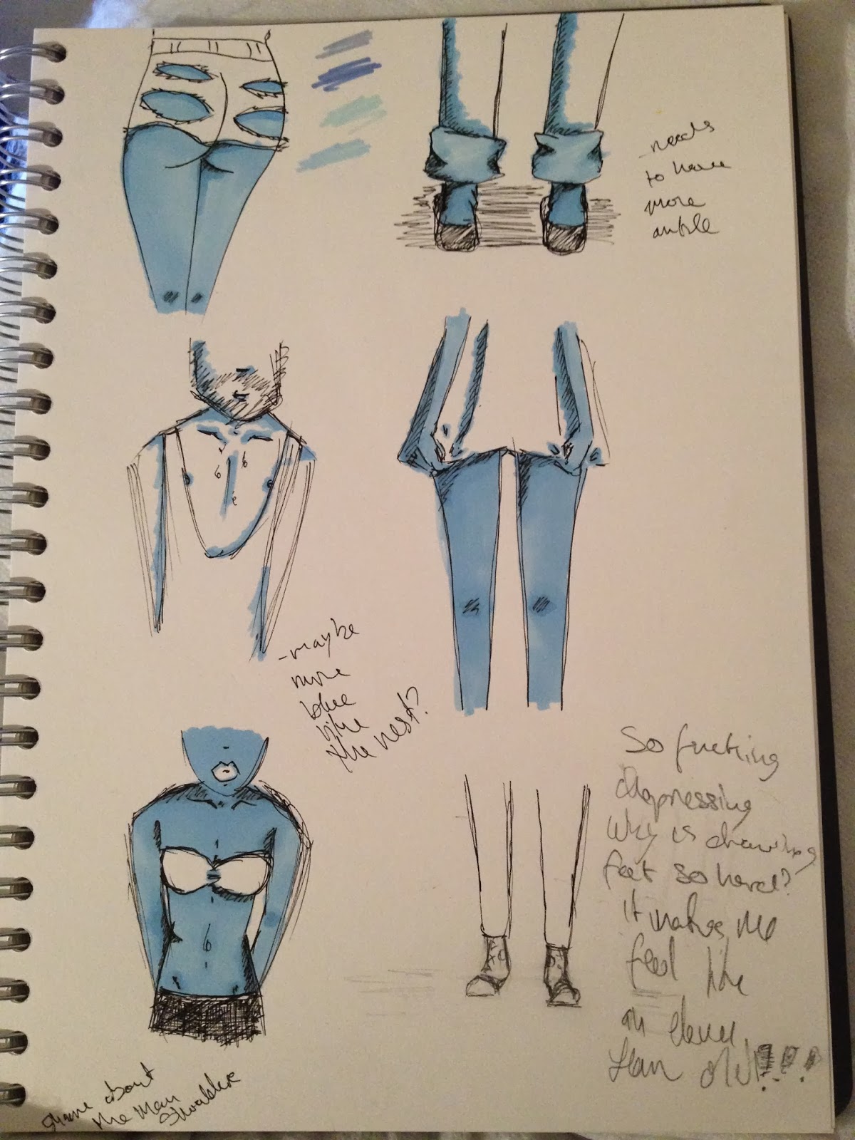
I'm very happy with the finished drawing of this bum, I think that I managed to get the view point just right to see the right amount of curve and cheeks. I'm happy with the mistakes in this one as well as the little divot at the top of the cheek actually implies that the shorts are even tighter and just creates a more detailed butt. The same works with the mismatching rips as while I think I wouldn't do it again like that, it actually makes me think of one side ridding up a little higher than the other.

I decided that I didn't want any eyes in my drawings as it can become a little personal and detract from the clothing, which is what we actually want to be noticed. With this drawing I think I got the rough pen to paper I was looking for but I should have worked on ones before it more. The head is a little too large and rounded for the torso, implying that he is a bobble headed man. The vest could also do with some serious work, I could have done with having an image reference next to me when I drew it. The whole top is much too angular and I should have spent some time putting in the folds of fabric to really stress how loose/baggy it is. I do however like how I did the chest, there's the right amount exposed and the little line hairs work better than the occasional curl. The little lines create a much better detailed version of chest hair that allows for a little peak at the trail of hair going towards his groin, this in itself implies just how low the vest is. The few curly lines were more humorous in a cartoon fashion but it didn't really give off the same exposed feeling.

I drew in the really rough floor as I felt it was necessary to ground him a little. In the rough above him, he looks like he's just floating but I also sorted the foot angle to be slightly better in the final too. Which helped to further ground him. However I think the biggest, best change on this one rather than the other is the leg hair. The leg hair adds a little humour, shows just how much leg is on show and it also confirms that the legs belong to a male. I think that it was important to show males as well as females to stress that we're not persecuting girls for wearing too little.

I had a look at some other short skirts for my roughs but I think that the flowing one works better as it really conveys that it could fly up at any moment. This drawing's main failure is in its oddly thin arms but as I had decided to try and work with my mistakes I kept them and just tried to make it look its best. I think that I'd just start again in the future but I do like the comparison with the legs. It also makes me think of her having extra thigh exposed.

I'm pretty happy with this one aside from the way that the left breast is bigger than the right but I suppose it could be considered factual. I again should have had a reference image next to me when I drew this to keep myself accurate.


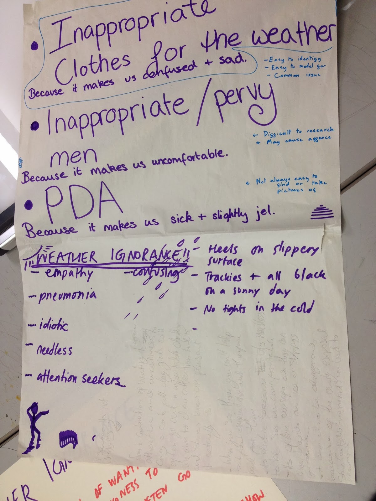
I'm pretty pleased with the final result, they were all placed into the blue triangle which Becky drew (and wrote) for us with the slogan we settled on. We stayed to having all our drawings on the one background and with the same writing to stress that we are a group and this is a project we've done together. I thought that this was particularly important as we each drew in our own way and just discussed it with the group. We decided to change the colour to be the background to make the sticker itself stand out and we chose the triangle for the same reason but with a hipster influences. It's these influences which inspired the font as we were discussed (and had a quick look at) it while Becky kindly sketched it out before sending the final text to us.
I think that the way the edges of the white tapers off works really well to deflect a little from the almost glaring white. Though that glaring white may only be in comparison to the mass of blue and my feeble lines. The main thing that I'd change about these are the thickness of the line, I'm so used to doing my drawings in a thin pen and not having to worry about it standing out I completely forgot about the impact (or lack of) it would have on a blue background. I saw from the rest of my group that the bold thick lines worked so much better for this project. It was thanks to Zara that my stickers even work as it was her that told me about the burn tool on photoshop. This allowed me to get my shading in and make a slightly clearer definition between the drawing and the background.