1. What skills have you developed through this brief and how effectively do you think you have applied them?
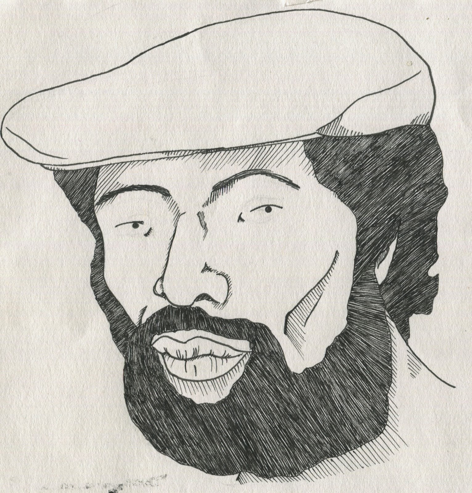
In this brief I actually drew a portrait of a person
that wasn’t a character and looked like them. This is something that I would
normally steer away from as I have in my head that I can’t draw real objects and
people. In this brief I found this to be false even it was overly referenced. I’d
like to try this more in the future but to try and find a balance between it
just looking like the photo and it looking nothing like them. I also worked
more with borders in this as I’ll often finish the drawing and lose interest. With
the border there it gave me a space to work in and gave the work a more
finished feel. This was especially true when I drew the border as a tv this
meant that I’d taken it further and actually developed it past where I would
often stop.
2. What approaches to/methods of image making have
you developed and how have they informed your concept development process?
I had to work more digitally in the first two briefs,
which I don’t think I did well with me but my failings with it have taught me
to consider how I should draw with the knowledge of what is going to be done
digitally in mind. My failings have also taught me that I should stop avoiding
the digital side just because I don’t like it and actually learn how to use
them to my advantage. For the last brief I worked in coloured ink which I’ve
highly enjoyed as it had everything that I normally love about drawing with a
dip pen while standing out much more.
3. What strengths can you identify in your work and
how have/will you capitalise on these?
I've realised that having a border, particularly an
interesting one can make my especially simple drawings look much better and
more finished. I would like to try this again with other scenarios. I also have
enjoyed working in dip pen again as it mostly forces me to just draw and accept
the little ink blots and mistakes instead of stressing about them or starting
again. I would like to draw more often with a dip pen but digitally colour and
edit them.
4. What weaknesses can you identify in your work and
how will you address these in the future?
My main weakness has been my time management as I've run out of time a lot on this module and It has got to the point where I can’t
let it happen again. I'm going to go back to doing daily to do lists and start
making sure I work to a certain time every day. My other weakness is how hard I
can find it to get motivated when I become disinterested in the brief, this
happened in all three as none of them were fields I would normally work in. To address
it I normally try to find something to like about it, this worked really well
with the last one when I did the tv’s but with studio brief 1 it affected my
group because I wasn't as helpful as I could have been and in studio brief 2 it
meant that I spent so much time happily drawing the characters that I ignored
the digital side even though I knew I had no idea of how to work it.
5. Identify five things that you will do differently
next time and what do you expect to gain from doing these?
.Work until at
least 5 everyday – this should ensure that I get a steady amount of work done
at a steady pace rather than having to do the bulk of it in a stressful panic
at the end of the project.
.Do daily to
do lists – this should constantly remind myself of what I need to be doing
while still having the satisfying feeling of accomplishment as I’m able to
cross out what I’ve done. It should also allow them to be in a constant state
of change so that If my ideas change it’ll only affect the days plan rather
than changing months timetable.
.Not allow my
disinterest to stop me from working – I expect this to mean that I’d get more
work done. Even if I’m doing it at a painfully slow rate. It would also ensure
that if I’m in a group my behaviour wouldn’t affect the group too much.
.Talk to
either Matt or Fred when I have no idea what I’m doing or when I’m behind out
of my own stupidity – this would hopefully help me to get motivated again and
would show the tutors that I’m try to work through it.
.Blog every
week (maybe every three days) – as well as being unmotivated to work I have
been avoiding writing and it has meant that I’ve had to blog most of this
module in the space of two or three days. I’ve found this horribly unpleasant
and stressful. I can’t allow this to happen again.
6.How would you grade yourself on the following
areas:
5= excellent, 4 = very good, 3 = good, 2 = average,
1 = poor
1
2
3
4
5
Attendance
x
Punctuality
x
Motivation
x
Commitment
x
Quantity of work produced
x
Quality of work produced
x
Contribution to the group
x
2. What approaches to/methods of image making have
you developed and how have they informed your concept development process?
I had to work more digitally in the first two briefs,
which I don’t think I did well with me but my failings with it have taught me
to consider how I should draw with the knowledge of what is going to be done
digitally in mind. My failings have also taught me that I should stop avoiding
the digital side just because I don’t like it and actually learn how to use
them to my advantage. For the last brief I worked in coloured ink which I’ve
highly enjoyed as it had everything that I normally love about drawing with a
dip pen while standing out much more.
3. What strengths can you identify in your work and
how have/will you capitalise on these?
I've realised that having a border, particularly an
interesting one can make my especially simple drawings look much better and
more finished. I would like to try this again with other scenarios. I also have
enjoyed working in dip pen again as it mostly forces me to just draw and accept
the little ink blots and mistakes instead of stressing about them or starting
again. I would like to draw more often with a dip pen but digitally colour and
edit them.
4. What weaknesses can you identify in your work and
how will you address these in the future?
My main weakness has been my time management as I've run out of time a lot on this module and It has got to the point where I can’t
let it happen again. I'm going to go back to doing daily to do lists and start
making sure I work to a certain time every day. My other weakness is how hard I
can find it to get motivated when I become disinterested in the brief, this
happened in all three as none of them were fields I would normally work in. To address
it I normally try to find something to like about it, this worked really well
with the last one when I did the tv’s but with studio brief 1 it affected my
group because I wasn't as helpful as I could have been and in studio brief 2 it
meant that I spent so much time happily drawing the characters that I ignored
the digital side even though I knew I had no idea of how to work it.
5. Identify five things that you will do differently
next time and what do you expect to gain from doing these?
.Work until at
least 5 everyday – this should ensure that I get a steady amount of work done
at a steady pace rather than having to do the bulk of it in a stressful panic
at the end of the project.
.Do daily to
do lists – this should constantly remind myself of what I need to be doing
while still having the satisfying feeling of accomplishment as I’m able to
cross out what I’ve done. It should also allow them to be in a constant state
of change so that If my ideas change it’ll only affect the days plan rather
than changing months timetable.
.Not allow my
disinterest to stop me from working – I expect this to mean that I’d get more
work done. Even if I’m doing it at a painfully slow rate. It would also ensure
that if I’m in a group my behaviour wouldn’t affect the group too much.
.Talk to
either Matt or Fred when I have no idea what I’m doing or when I’m behind out
of my own stupidity – this would hopefully help me to get motivated again and
would show the tutors that I’m try to work through it.
.Blog every
week (maybe every three days) – as well as being unmotivated to work I have
been avoiding writing and it has meant that I’ve had to blog most of this
module in the space of two or three days. I’ve found this horribly unpleasant
and stressful. I can’t allow this to happen again.
6.How would you grade yourself on the following
areas:
(please indicate using an ‘x’)
5= excellent, 4 = very good, 3 = good, 2 = average,
1 = poor
|
|||||
1
|
2
|
3
|
4
|
5
|
|
Attendance
|
x
|
||||
Punctuality
|
x
|
||||
Motivation
|
x
|
||||
Commitment
|
x
|
||||
Quantity of work produced
|
x
|
||||
Quality of work produced
|
x
|
||||
Contribution to the group
|
x
|
||||