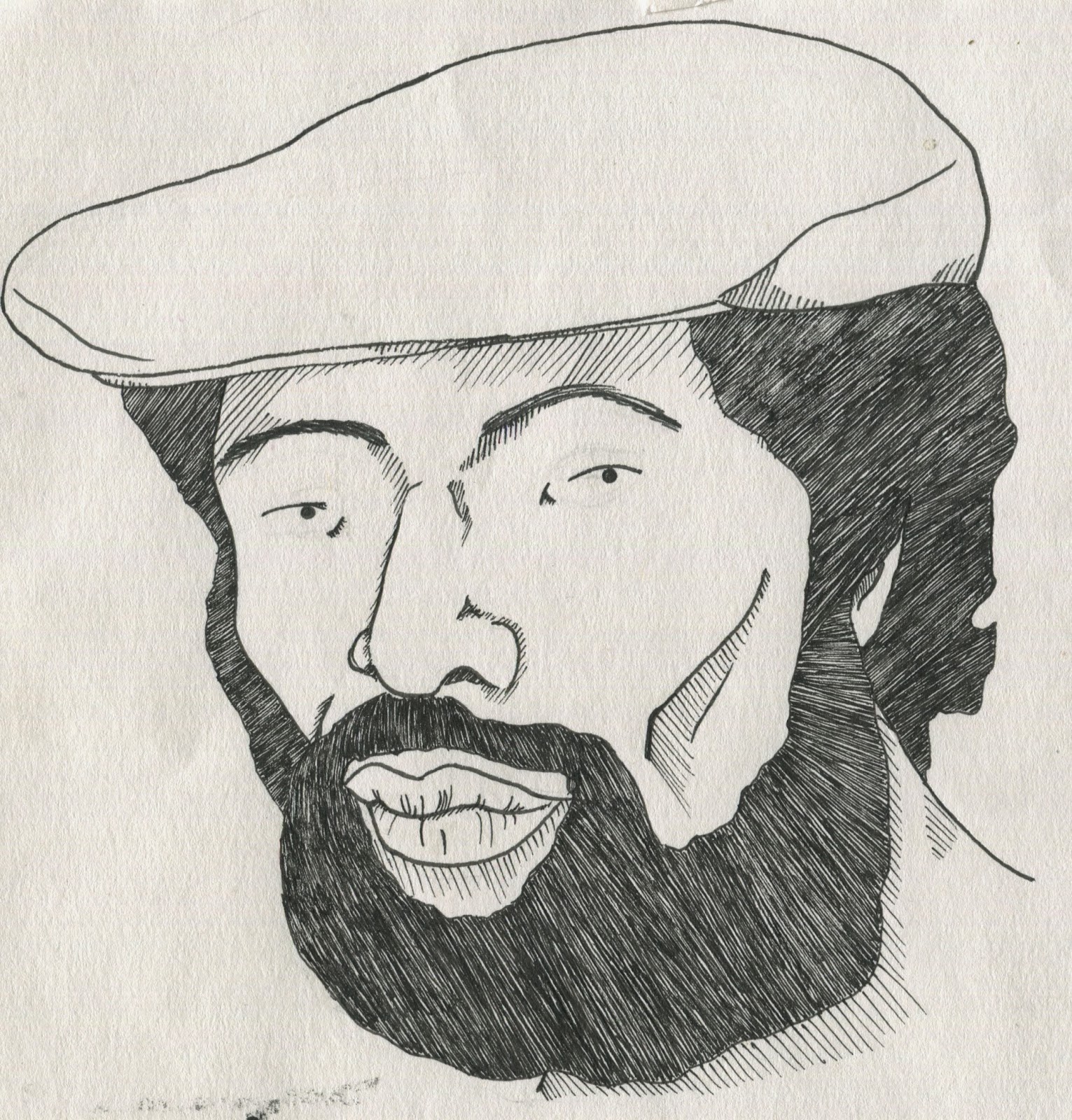
I actually drew this right at the start when I had no idea of what I was going to do but I really like it. Though I think it may be overly referenced as it looks a little too accurate, the eyes I drew do work well against that however and I'm really happy with the hair and beard in particular. I like to use fine liners to fill a space like that again. I wasn't sure where I'd take this though and after studio brief two I wanted to work more with colour.


With this in mind I tried to make him more of a character and bought some coloured inks as I'd like to work in dip pen. I Thought it worked quite well in its first picture, with just his face drawn. It had the bare necessities of what is recognisable to me, his prominent cheekbones and his nose (though I am unhappy with that nose and should draw a different one). I then drew in the surrounding features and tried to colour areas but colouring shall require more practice as it came out too rough. I don't think he looks enough like Gil Scott Heron to be worth doing so I returned to drawing the nubs and the mouth.

This is just a page of mouths without sex appeal.

This is where I drew the beer out in a much better design, it works best as the bottle that the duff inspired can. I also found that rather than block colour, which made it a little rough and busy, the shading lines looked much better.

I drew the first one out again as I preferred it but I did it in colour with a dip pen and played around a little with it. As I liked it at every stage I took regular photos to make sure I didn't ruin it. I also took them because I really like the first one it reminded me of illustrations like Norma Bar's and of Mr Bingos hair project. I think this illustration of Gil Scott Heron works rather well and would like to use it for my finals.


This is where I tried to combine the character version and the referenced one ... it didn't work.

No comments:
Post a Comment