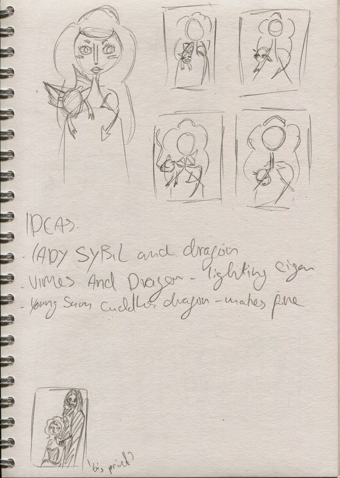
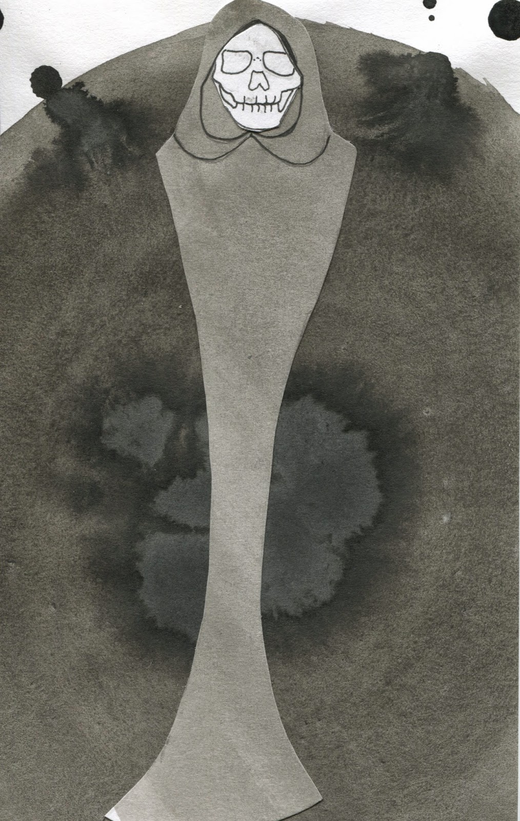
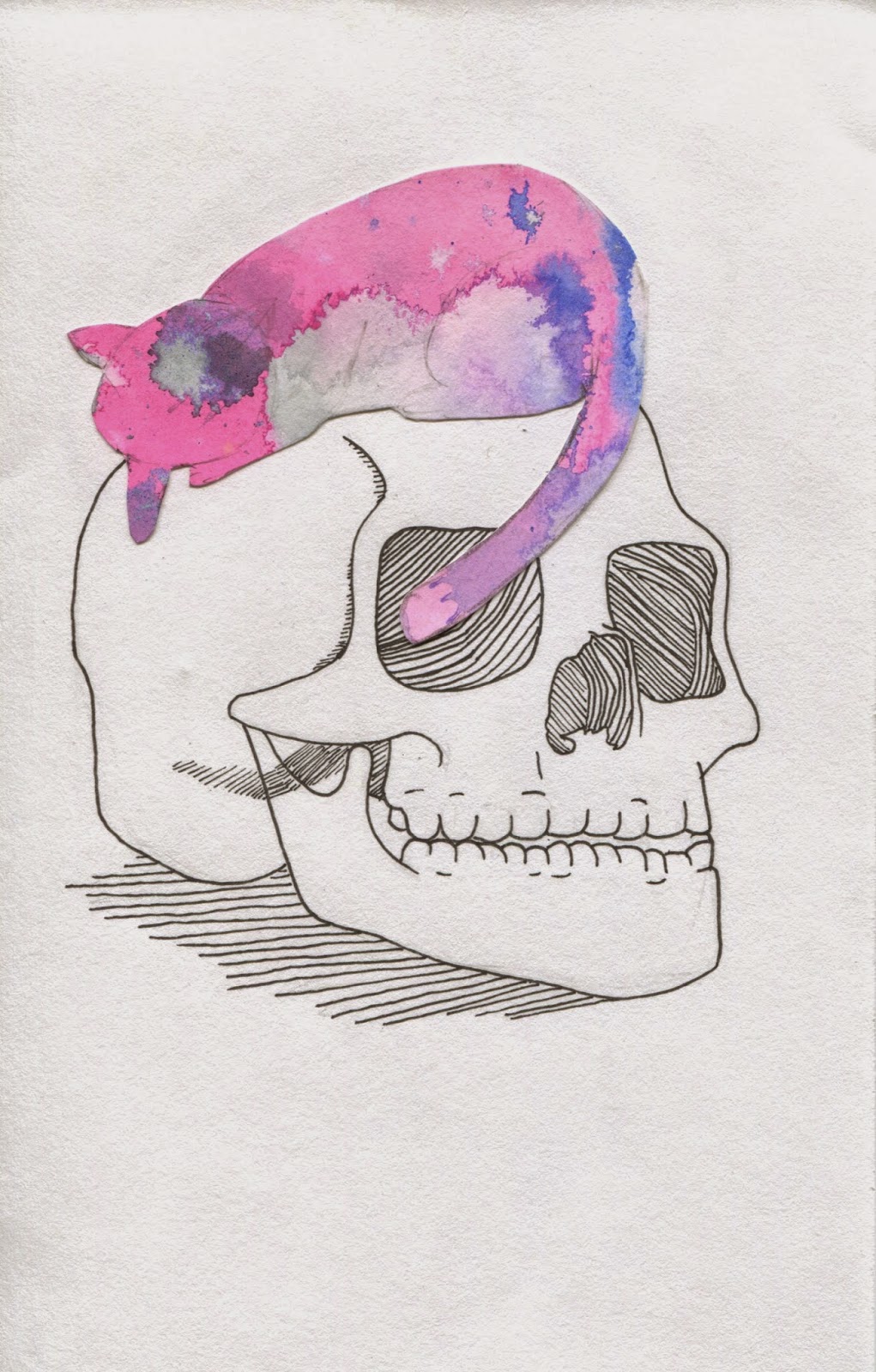
Friday 12 December 2014

Moving parts


This is a plan of what parts I'll need to be able to move if I make my animations stop motion.

Dragons

It took quite a while of drawing out the basic shape described in the book before I felt like I had adequately captured a swamp dragon to use in my animations.

quick storyboard

These are some very simple four frame storyboards to show what I intend to do.

Initial ideas


I managed to simplify what I want to do for my animation as well as find a way for them to have a common theme. In my three animations I plan to use each member of the vimes family interacting with a swamp dragon. this means that I should just be able to animate the smoke and some small body movements. I believe this will be much more manageable.

Hot dog research

As I'd finished the characters I moved onto how to actually make a hotdog book as I'd only heard about how to do it off people. I had never made one before, which is why I have been so keen on making one. I have wanted more experience in making simple books as that is the area I would like to move into. 


However as I'd heard so much about how they were simple I shoved the thought of making the book to the end of finishing my characters. This led to the crushing realisation that I had let myself think solely of the characters without checking to see how many pages you get with a hotdog books. Since realising this I have had to revise my character list based on who I think will work best in the book and how well I think I've drawn them.

finals ready

These are the finals ready for print. I think that I've managed to get the personalities right, at least my interpretations of them. I found it both difficult and intuitive. However I don't believe I've done enough work into the frames or into the possibility of half tone.

frames revised

Unfortunately in my haste to finish the drawing part of brief 3 a few of the frames I drew were unusable and I had to draw new ones with more care.

frames

These are the frames I drew for the characters. I drew them on tracing paper to try and get the right shape to go around the characters.

final 10 next step

This is them again but cleaned up and just the lines.

Final 10 Characters

These are the final line drawings for the characters I think I managed to show who they are through expressions and positions. Now I need to edit them to look cleaner and be ready to print.

frame research


As I realised that I hadn't put enough research into the frames that were going into my illustrations so I spent a day in my favorite coffee shop and drew all the frames they had on the wall opposite. unfortunately I think the ones that I like won't print clearly at A5 but they would be good for any A2 or A3 prints I could do.

If I have time


These are the plans I made for three or four large prints in a family portrait format. The idea is to for them to be much more detailed and a three layer colour print. As they'd be A2 I'd be able to do better line detail without fearing that the quality would be lost in print. However from where I stand now with my work load I highly doubt I will be able to do anything with these.

10 Characters


These are the 10 characters I have chosen to illustrate, I chose them mainly based off my own opinions of the characters and the books as I'm making a book more like a fan zine. From this I'd rather choose characters I know and love, with this in mind I hope to convey the personalities of the characters as well as give them a more defined appearance.

Action Plan 17/11/2014


This is an example of one of the action plans I have made, but mostly I have been making weekly plans with exactly what I need to do each day,

Project Proposal Moving Pictures


Project Proposal Printed Pictures


Tuesday 11 November 2014

Animation

This is just a little plan I did to remind me of what I wanted to do for animation.


Screen Printing

For my screen print I used the line work from a Susan I'd drawn earlier and I think it came out really well, I like the frame a lot and I think that's where I'm going to take the printed pictures brief. Next I'm going to look into adding some block colour on another layer, maybe the frame? maybe the background? I think that it might be best to keep the character as just the lifework but add more detail, though I should try to incorporate little aspects of colour. The other thing that the worksop made me think about was how colour appears on a page, it's one thing to like a colour in the pot but the colour on the paper might be different and I'll need to test any colour on the paper I want to use.


Newsprint 


Cartridge 


Heavy stock somerset 


Lady Sybil


This is Lady Sybil from Discworld She's not as limited as she would for screen print but I think t's an improvement and it reminded me how important shadows are, I'll have to pay attention on how best to add them on a screen print.

Drawing for fun

These are a couple of drawings I did in-between drawing people for cop, I really like them and enjoyed drawing them. Its made me realise that I need to do more for myself to remind myself that I do like drawing. I plan on turning the last one into a screen print, I thought this would be good to teach myself to finish illustrations and to practice for studio brief 3.

Discworld characters

These are based off the research I did and I'm going to try limited colour palettes with them in photoshop so I can work towards screen printing them. Though I think I'll need to draw each character more as they seem to get stronger the further I take them, some of the weakest being the first time I've tried to draw the character.

Discworld character research

To fully ensure I knew what I was doing with the characters I spent some time researching how they're described, what they are known to wear and recognisable attributes.

Tuesday 4 November 2014

Proposal

Studio Brief 3:

I intend to produce a small screen printed book of Discworld characters and a few (4-5) more detailed, larger prints. It will focus on the characters, the different genre of Discworld book and the best quotes from the character. I will be aiming to communicate the Discworld characters, humanity and the sensible absurd that is Discworld. My audience is mainly fans of Discworld but I also want it to apply to potential fans and people who've only seen the adaptations.

Studio Brief 2:

I intend to produce 4 10 second stings showing 4 of my favourite characters (or character groups) based on what I am doing in studio brief 3. It will be aimed at the same as printed pictures and will focus on the same as well as how the characters relate to each other.

Tuesday 21 October 2014

Character experimentation

I continued this process and experimented with disc world characters. I also tried one without lines and I hate it, because I think it loses focus and detail. The last Susan is my favourite as I drew it with different pens to add a different line quality. I really don't like the Death but that may just need practice.

Drawing for fun or Doodles worked into

I took these doodles from my note book and decided to put them into photoshop. I really like this as both a style I drew in and as how I coloured it. The drawn parts I like because they have set forms that make the whole thing quicker and a bit weirder. The photoshop I like because its the first time it hasn't looked flat and the colours all work well together.

Monday 13 October 2014

What I'm reading

I've just finished re-reading Thief of Time as i've been drawing Susan a lot I thought I should read one that is Susan heavy and now I'm half way through Reaper Man as I've also been Drawing a lot of Death. 


Post 12 feedback and evaluation


12 collage & line

For the intangible I got heavily confused and generally a bit stressed about the whole thing. Surprisingly it turned out to be that I'd been overcomplicating the whole thing and I just needed to sit some where neutral (that also makes good coffee) and write/draw it out. Once I'd settled on showing Death as doing his work rather than Death as his whole complex self (aside from the cat one, that is all Death) I found it a lot easier to come up with ideas and how the colours and composition could show what I wanted. I then made some new textures to go with what I wanted to do. For the black/gray it was using ink to make patterns/mark and then the majority are what ink looks like bled through paper. for the colour I just found my old brusho experiment paper and thought it was appropriate for Terr Pratchett's Death.


Peer review

The peer review about what work we'd done so far. The general consensus was that so far we'd being doing a to of good playing about and that texture adds a lot to a drawing, and that it should be considered further.


Line and collage

This was really fun to do and a great reminder of how much I like collage but it also reminded me how annoyingly fiddly it can be. I think the best of these is when theres block bold colour combined with lots of line detail in little areas as it provides a good contrast and the worst being where the shape isn't strong enough to properly convey that it's a skull.


Collage

A quick bit of collage of Eleanor, I think my favourite is the scythe at the bottom as using completely wrong colours made the others seem cartoony and childish and the addition of the textured paper on the blade makes it look a little more ominous.


Line task 3

This is just showing distance with thin, regular and bold lines. Though I am a bit annoyed that I wasn't able to work out good enough compositions so the items didn't look like they were floating.