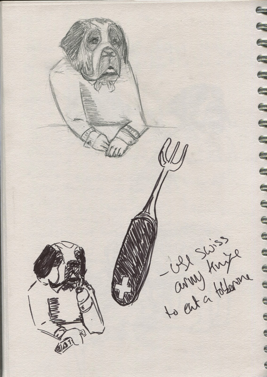
As I decided to try and make characters from national creatures I looked up some reference imagery and do some pencil sketches to get a feel for the shape of them. Before doing some more with a felt tip pen, I found that the felt tip aloud me to just draw without getting overly worried about how accurate or good it was. This both sped up my sketches and allowed me to just play with how to draw them. I also found that as I had no choice but to leave the mistakes in I was more accepting of them and when I could I worked them in.
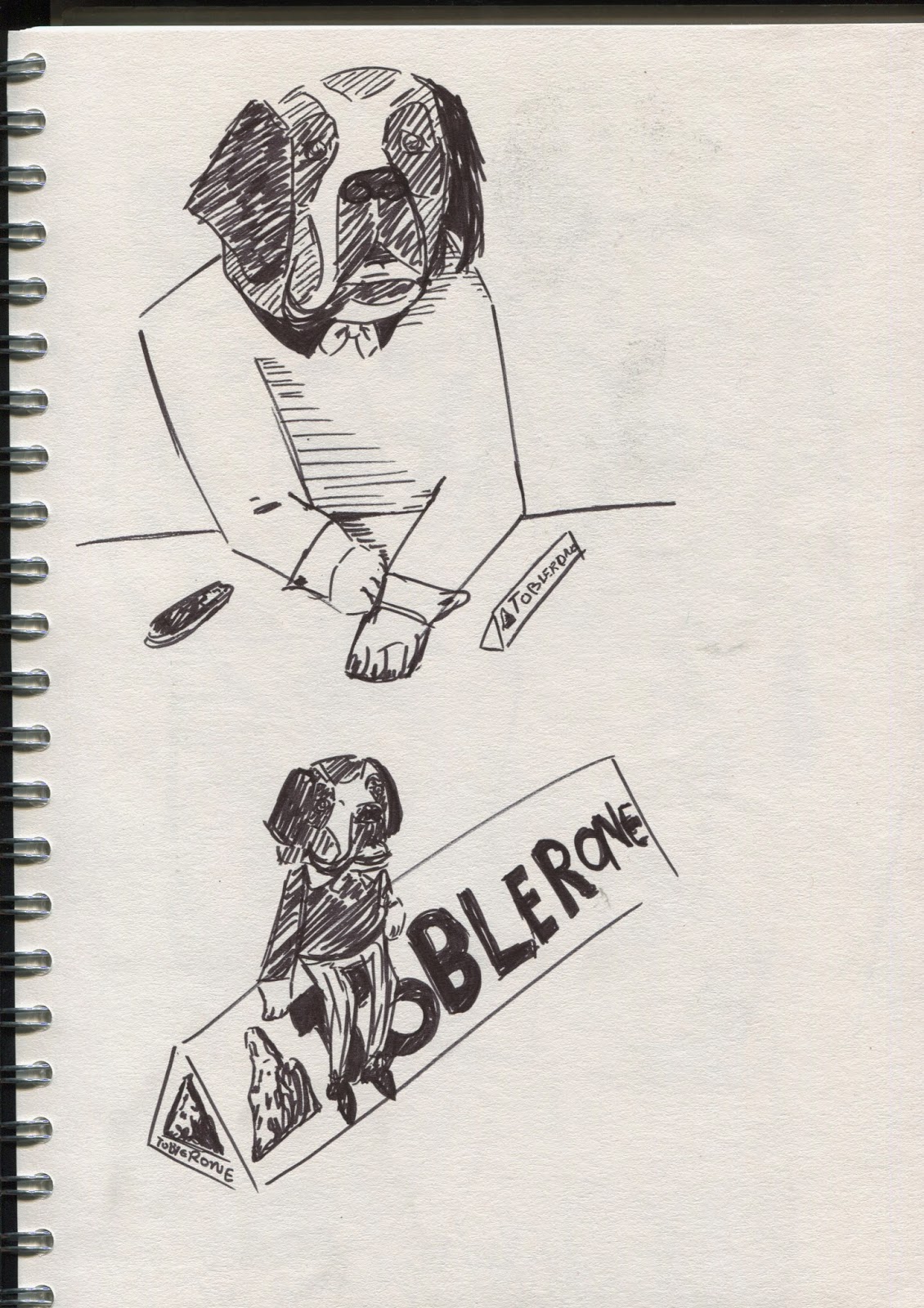
I found the st bernards simple to draw as they are essentially just a big dog and was able to quickly play around with them before moving onto the bears. Though I should have spent more time drawing him in different positions and not just accepted the first character just because I liked it.
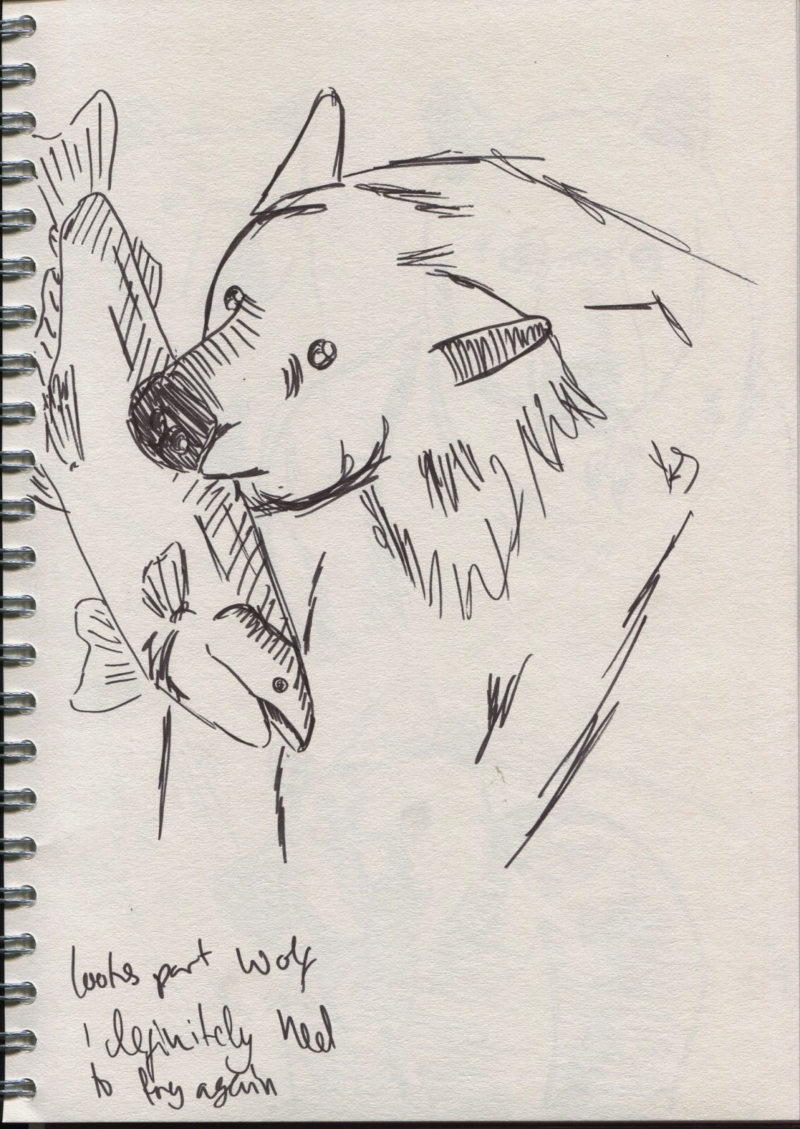
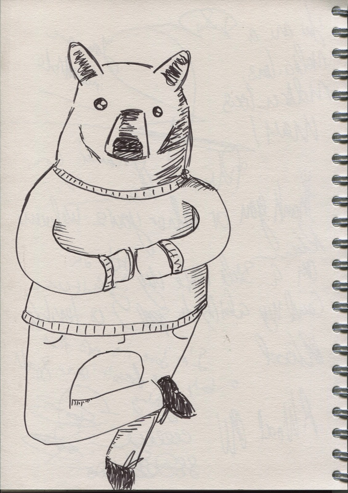
I loved drawing the bears and was able to go between drawing them as normal bears and as characters easily as black bears, like st bernards already give off such a strong idea of who they are as a character. I tried to draw him holding or eating things I associate with Berlin; beer, bratwurst and currywurst. I think I should have put more work into what he looks like when holding objects as they are often out of proportion or just look odd. Also as much as I love his bow legs to be truer to the bear it should probably have thicker, stubbier legs.
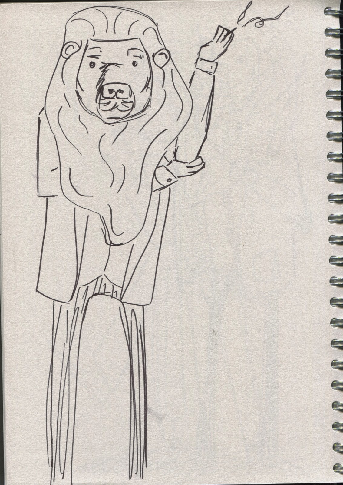
I found the lion very difficult to draw as it has such an old, odd design and it only got better as he became a character. As he's Italian I tried to draw him quite trendy as well as him smoking with coffee. I think these would have worked better if I could have found better reference images or if I had managed to have got a feel for how he looks and drawn that instead of trying to replicate the statue.
A short break from the lion as I found the bears so fun to draw.
I found that I just eventually got a feel for how he moves and acts after just letting him evolve through the multiple sketches. That and I slightly had Richard in mind as I have always thought of him as a lion man.
Some more bears, I thought that like with the artist bear and the tough bear earlier, I should play around with the character to make sure I didn't just choose the first thing I drew without trying others. I also thought I should try drawing a female character as they'd all been male so far. I enjoyed making the little changes to make her female, in particular I'm happy with the chubbier legs with heels as I think it suits the bear better. However I don't think It's as strong as the other bear, perhaps its her position or just that I haven't drawn her as often but she lacks some of the charm of the bow legged bear.
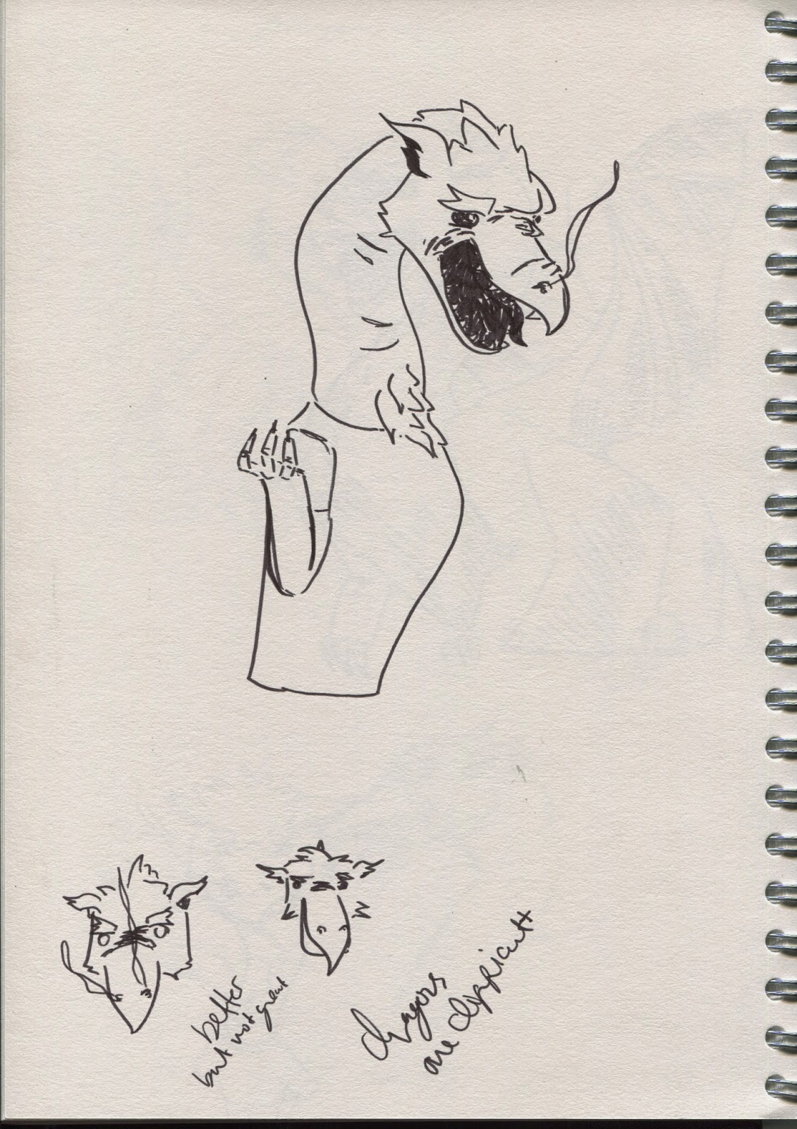
I looked at a bearded dragon to try and see if looking at an animal close to a dragon would help, it didn't this time as it looked so different.
I had such real trouble drawing the dragon From the statue I looked up the coat of arms to try and base it off that instead.
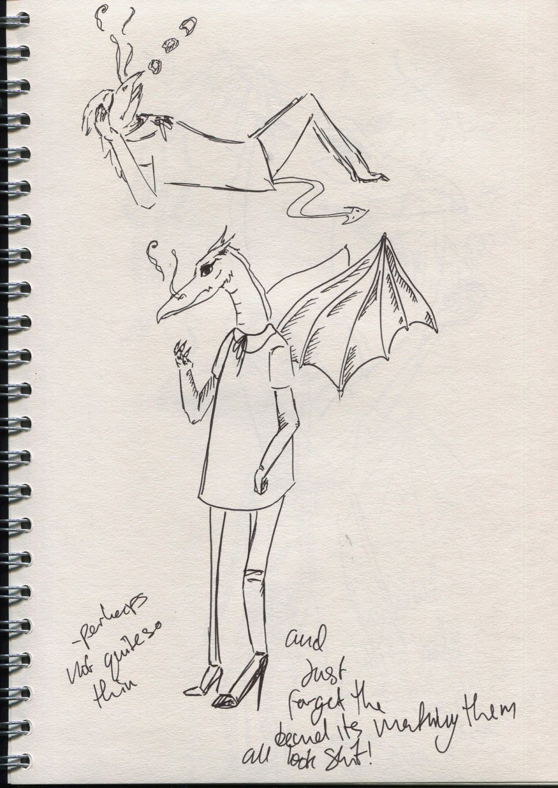
Drawing it from the coat of arms was fine until I tried to turn it into a character, all I knew at this point was that I wanted to draw her as a female as her slender neck suited it and I'd only really drawn males this project.
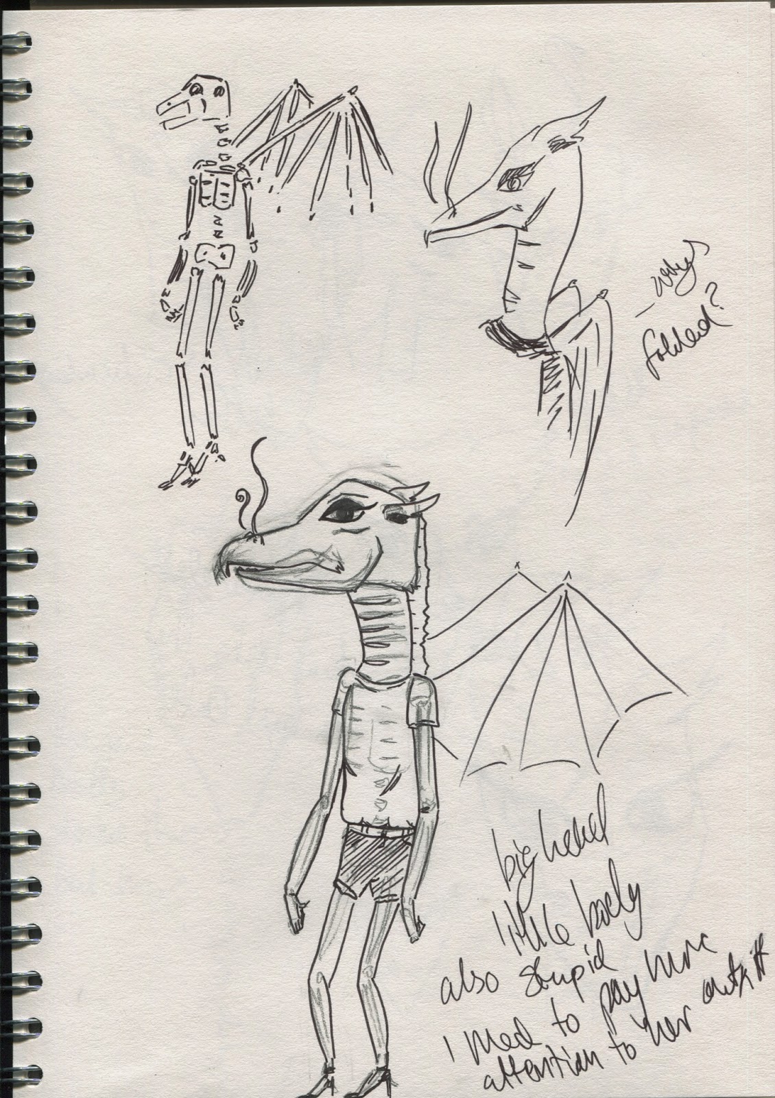
As the coat of arms is 2D I had no idea of how to draw her properly so they'd all been rather flat before this and I tried to draw out her skeleton to get a better idea of how she's structured.
It was here that I managed to draw her head on. I did it first in the top right hand corner, which is still my favourite but for some reason I was unable to replicate it and for most cases they looked like odd anteaters.
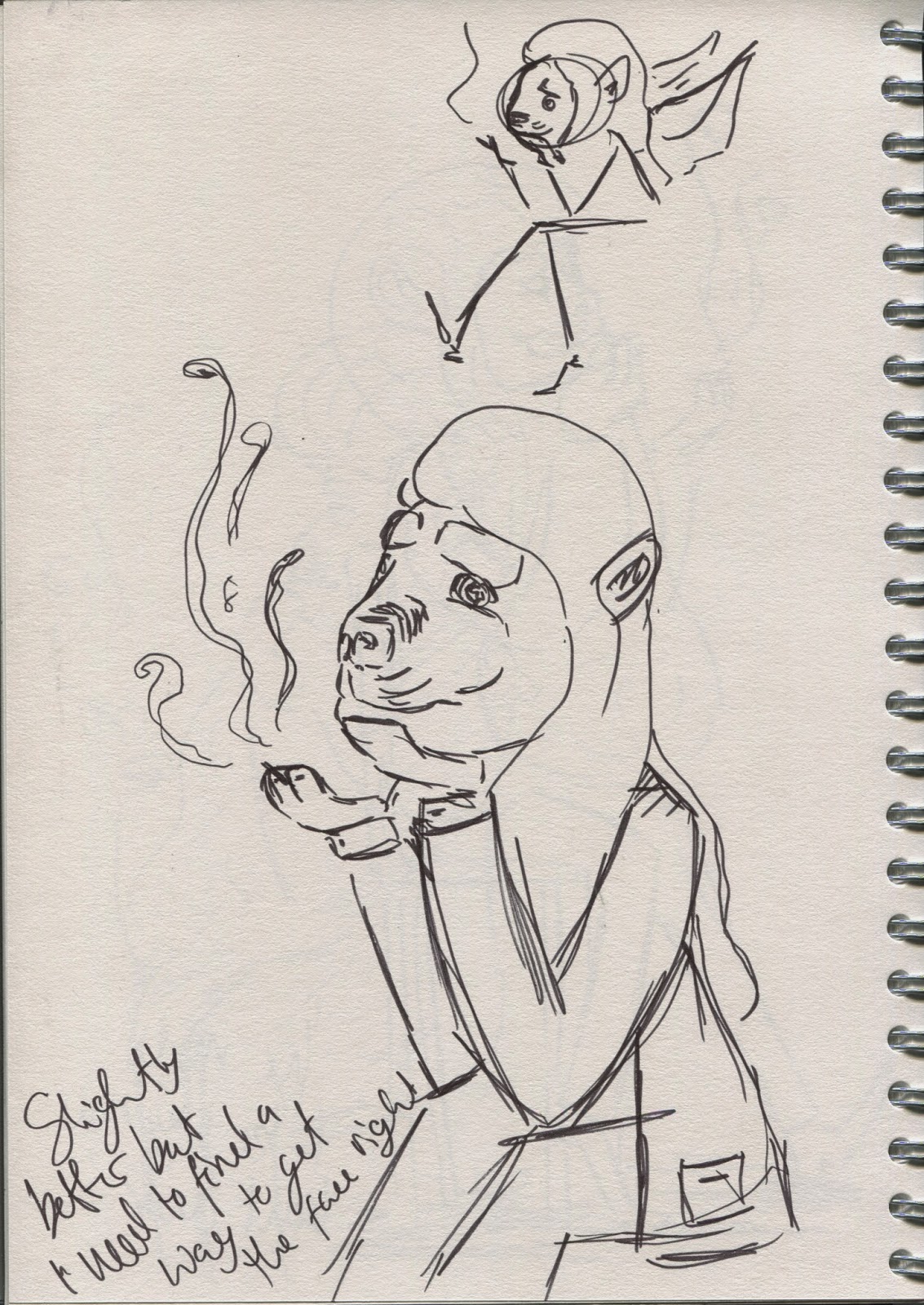
I really liked this position as she looks feminine and relaxed while showing she's a dragon with lighting the candle with her breath. The candle is there as I massively associate them with Slovenia (they have a summer festival where they place candles in egg shells and release them onto lake bled).
I Think it would have been much better if I'd played with this character more but after so much time working on how to draw her I became fed up with it and just wanted it done.
A wing as with the lion and dragon I'd started focusing so much on the characters that I'd forgotten how important the wings are to both of them.