Monday 27 January 2014

Final Crit: Feedback and Evaluation


Printing

When it came to printing I had some issues, some my own fault and some technological. I had been going to my mum's house to print and not left myself anywhere near as much time as I should have done. As I had not thought about my mum's laptop and how slow it runs I had left my indesign work to do when I got home. This turned out to be a mistake as it failed on me multiple times and took me around ten times longer to do than it would have done in college. Next time I'm going to prep to print at college before printing at my mum's. I had also forgotten how awkward it can be to order the pages yourself before manually getting your printer to print on both sides and there was also the couple of times when I just plain forgot to take off the guide lines (I forgotten what else you call them).  As shown below.


feedback

This is my feedback form Orlaith it basically says top do more research, not settle on the first idea and to managed my time better.


Final pieces

These are the final pieces all inked and while in some places it is a little more messy than I would have originally liked, I like how they came out I the messiness works well against the neat lines and the gray scale gives it more depth than it had before.


Final pieces pre inking

These are all my final pieces pre inking with new details added .


Not a lot changed with this one but I'd still love to have been able to work on the perspective in them.


The little details added in these did improve them immensely. The addition of  a skirting board suggests that its indoors and creates a better sense of what is the floor and the wall. The objects on the wall also nicely break up the mass of white space that used to be there. The addition of bench legs while necessary to make the fact it is a bench clear could have been done much better. I had forgotten about the legs until after the skirting board, this means that they not only have a line going through them they also have terrible perspective and a re placed far too close together.


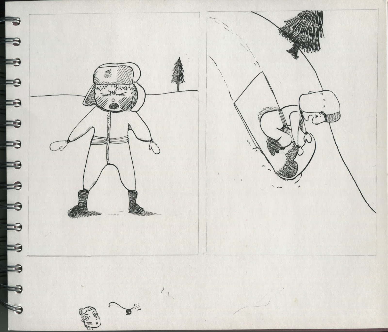
These would have turned out better if I had got a better grasp of where to place the upward facing lines and if I had not drawn the second slightly to the left. I do however think that the tiny running boy and the way I drew the broken penguin worked well. I think this because they are two quite difficult things for me to draw, I think I managed to capture the movement in the first (thanks to reference images) and managed to convey what the second is (something I found highly difficult).


I don't think I changed anything in this one but I still think that the pattern and detailing on the clothes make these much more interesting than some of the others. I also think that I should work on the anatomy of the legs in particular as I seem to have lost control of where should be rounded and where it should go in.


I still don't like this one as much as the others but the added detail has improved them as it gave it a much better sense of where they are placed and cuts up the white space.


This one I really like though the boy could be a little more centred, overlapping the window in the first drawing. The second drawing is mainly lessened by the massive hands that look like they belong on a monkey.


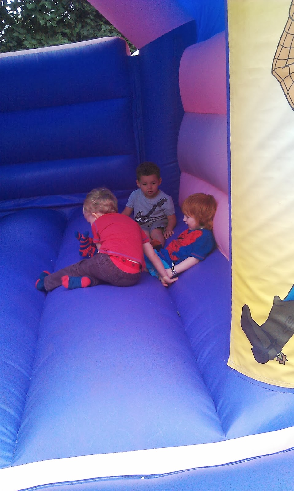
I am very happy with these two I had never drawn a bouncy castle before (or at least not properly) and I was very pleased with the results. I could however worked on the perspective of the boy and got some reference images to help this.


The former of these two is better than the latter as I think the shape of the boy in the suit works well even while the step isn't as well done as I'd like. he latter is okay and it has the good background to it, I'd be happy with it if i had left enough room to draw his hand the right size, as it is he looks like he's able to stick his whole arm in his mouth.

Bouncy castle roughs

As I added another new anecdote to my list I drew out some roughs for it. After asking Lauren for her opinion I decided on doing the top right of both of them. In the one directly below it was because of how viewing the boy from the side is a lot easier to see how he is position and his position shows his emotion. In the latter it was because I'd been wanting to use that pose for a while, it is the accurately stereotypical pose for a toddler in a tantrum.   


Chocolate pengiun roughs

Still not happy with the composition on the chocolate penguin for the first page, especially after I wrote the anecdotes. I wanted to show the speed at which he ran away, that and that he actually did run away with it. I chose to so the second one as having him so far away gives the impression that he's moved there quickly, having all the lines pointing to him suggests the movement and with a bit of the surrounding area it becomes a tiny bit clearer that he's in the supermarket. 


Christmas roughs

As I still wasn't happy with the Christmas roughs I went back to do some more and I decided that him standing up slightly away from the bag but still with a tight grip on it conveyed him being sad without looking as angry.


I also tried one last colour test to see what it would look like to have a mixture of colour and monochrome. It didn't work like I'd hoped as inevitably it just ended up looking like I hadn't finished colouring in.


Halloween roughs

One of the anecdotes I came up with while writing them is about Halloween, I added it to my list and sketched out some roughs 


I did the bottom left of the above page as I really liked the idea of him sat with the bowl inside his crossed legs, it reminded my of my own childhood.


I also decided to do the bottom left of this page too as I thought it both was funnier and complemented the text more to have him hammering at the door.

Ink & watercolour tests

I printed off a couple of my pages to quickly experiment with in ink and watercolour. For some I also introduced further line detailing and some absolute black.


The one below is where I mainly experimented with the dip pen to add more detail. This really didn't work well on the hair in the second one as he looks either like its rainbow or he's in the Beatles, neither of which was the look I was intending. I will however be putting more line detail into the ground and background of all my drawings as it gives a sense of place and removes a lot of the empty space without making it too busy.


These were two very quick ones I did just testing it out with the dip and I think I may like them more than my finals. I think I need to work on removing some of the control from my final pieces but I need to work out how to be able to do that without completely messing up the composition and perspective 


Notes

I haven't been showing my notes and plans enough on my blog so here is my day by day plan, my calender plan and my to do lists. I tend prefer an ordered to do list as I mostly don't know if something is going to be very quick or very slow. I'll order my to do list from most important to least so that if I don't get as far as the bottom it won't be as bad.


From what Matt and a couple of my peers said my final pieces didn't look quite so final so I decided to go and look at some other illustrators black and white work from within my house. while looking at them I noted what they did so I could experiment.


Progress crit with Matt

This is from my progress crit with Matt it basically says to work on my time management, critical analysis and to work on getting my final pieces better


Tuesday 21 January 2014