Fineliner and Promarkers
My first response to the idea of children tantruming was to focus on the colour, The way a child's face will slowly change shades of pink before making it into that truly angry red. So initially that's what I tried to make, I wanted to do it in Promarkers and fineliners as aside from my summer 10 I've only used them for one other brief. As the other brief was a children's book I did for my final project last year I was reminded of them for this book project.
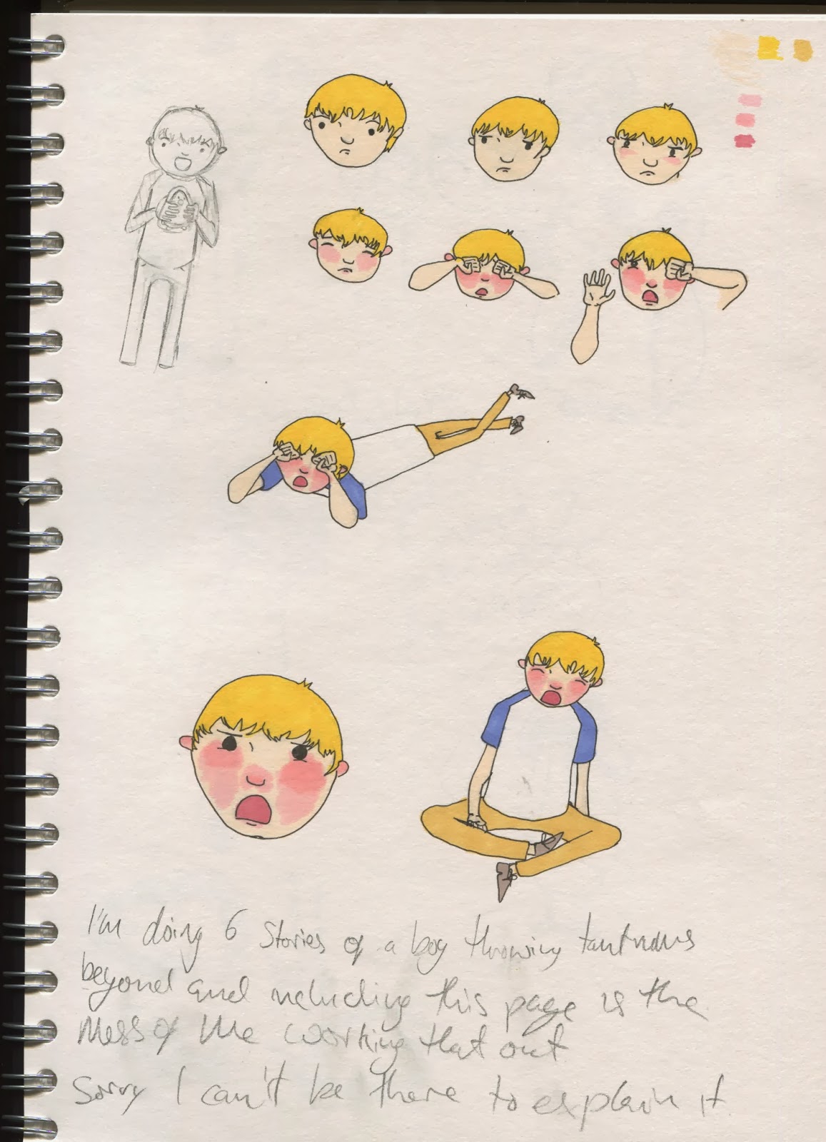
one of the things I did start testing on these first tests was the positions of the boy's body and arms, I was trying to mimic and work out how to draw how I had seen children get upset before. You can tell that I wasn't too sure of how to place everything, particularly on the one where he is lying down. The perspective is way off and the legs seem to be on a different angle to the rest of him. looking at that drawing reminds me that I need to work out the angle of the character and where the floor is before I start drawing. I decided to move away from the colour after I did these, as I really didn't and don't like the way the colour on the face has blended together. The way it is there it looks more like he is having an allergic reaction than crying. This meant that while I had located the right areas to colour it hadn't worked anywhere near as well in practice as I 'd hoped.
The continuation of thought
The below doodles are from my notebook as straight after my progress crit I started writing down anecdotes and trying to work out how to show the faces. These doodles helped a lot to figure out how I could show the emotion on his face with out colour. They also helped to work out the placement of the hatching, it was from these that I found that if I do some light hatching under the eyes and nose while doing some heavy ones on the cheeks I could convey the different shades of pink and reds from a tantrum without taking over like they did on the colour ones. I also helped me to show different emotion with the varying placement and strength of lines.


In these ones I was playing with how different positions will effect the outfit he wears for the shepherd story.
Dip pen and faces
For Christmas I was given some new and better dip pens and ink. This led to me having a play with them and doing some more work towards deciding how to show emotion through hatching. as well as my decision to do my illustrations in dip pen. While the actual bodies on the people I drew are terrible (like my notes say) these really helped me to progress towards how I wanted to do my illustrations.


With this one above I had a look at introducing watercolour. on the first one the pink is far too strong and while I did ultimately get the shade down to an acceptable level I still preferred the purely dip pen one.
Into the sketchbook

After those first colour test this was the first thing to actually make it into my sketchbook and the top left shepherd is one of my favourite dip pen drawings. Aside from that this is a page of tests that I did before I knew what to focus on.
No comments:
Post a Comment