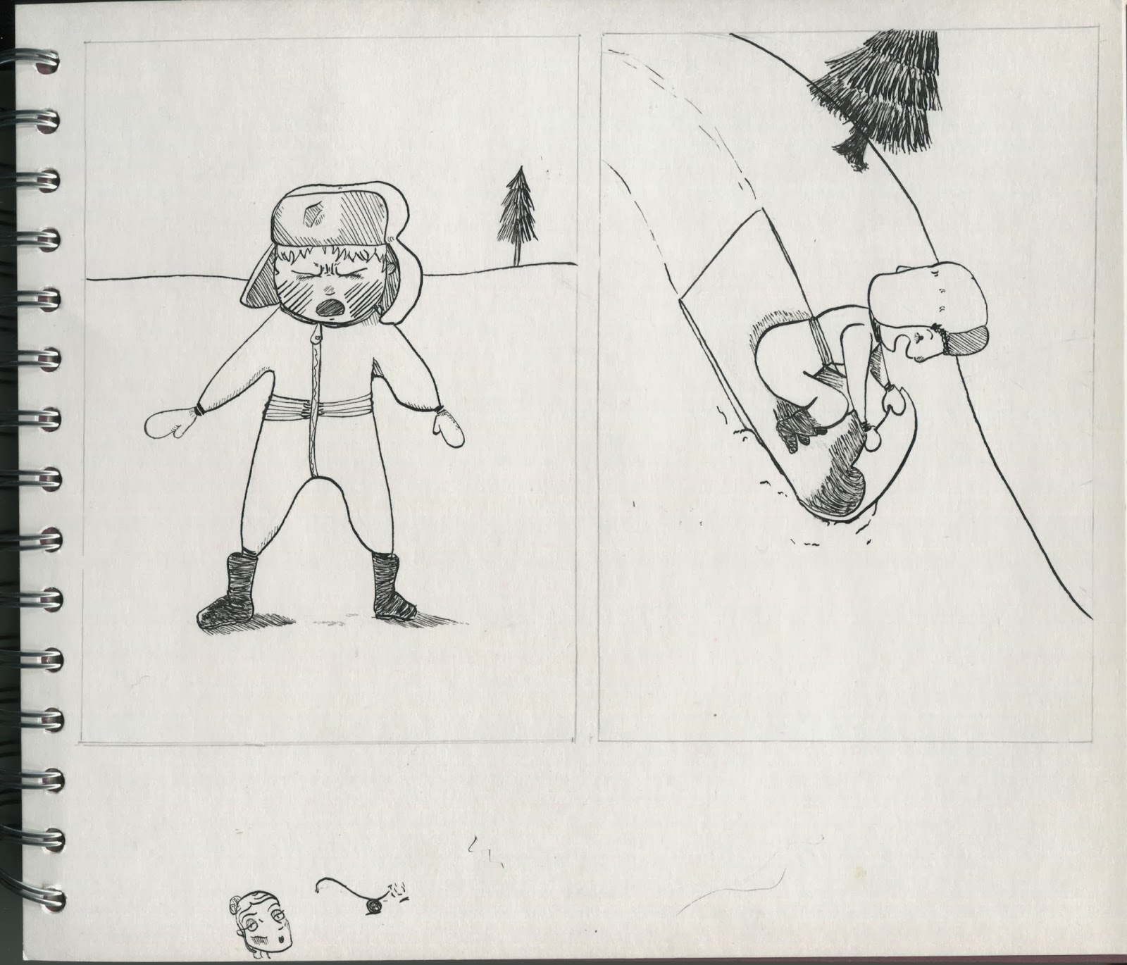
These are all my final pieces pre inking with new details added .
Not a lot changed with this one but I'd still love to have been able to work on the perspective in them.
The little details added in these did improve them immensely. The addition of a skirting board suggests that its indoors and creates a better sense of what is the floor and the wall. The objects on the wall also nicely break up the mass of white space that used to be there. The addition of bench legs while necessary to make the fact it is a bench clear could have been done much better. I had forgotten about the legs until after the skirting board, this means that they not only have a line going through them they also have terrible perspective and a re placed far too close together.
These would have turned out better if I had got a better grasp of where to place the upward facing lines and if I had not drawn the second slightly to the left. I do however think that the tiny running boy and the way I drew the broken penguin worked well. I think this because they are two quite difficult things for me to draw, I think I managed to capture the movement in the first (thanks to reference images) and managed to convey what the second is (something I found highly difficult).
I don't think I changed anything in this one but I still think that the pattern and detailing on the clothes make these much more interesting than some of the others. I also think that I should work on the anatomy of the legs in particular as I seem to have lost control of where should be rounded and where it should go in.
I still don't like this one as much as the others but the added detail has improved them as it gave it a much better sense of where they are placed and cuts up the white space.
This one I really like though the boy could be a little more centred, overlapping the window in the first drawing. The second drawing is mainly lessened by the massive hands that look like they belong on a monkey.
I am very happy with these two I had never drawn a bouncy castle before (or at least not properly) and I was very pleased with the results. I could however worked on the perspective of the boy and got some reference images to help this.


No comments:
Post a Comment