- If I'm drawing people from observation I should try and draw them realistically first and look at the posture with simple lines before I move on to my method of drawing - this will be hard for as What Fred called stylised drawing is just the way of drawing that makes sense to me as I find the more realistic way of drawing makes very little sense to me but it's something I should try to do more of.
- Applying my work to other forms - I've been thinking too much that my illustration Friday work is just about making the quick turn around and responding to a word, without trying to then use it for something else. Not every one of them will be applicable to other resolutions but my squirrel pattern is and I should mock up some cushions, notebooks and wrapping paper with it on (a friend over Facebook actually requested it as a wrapping paper).
- My characters should translate even when you don't know them - my character portraits are accurate and mainly follow how they stand but if you can't understand them if you don't know them, they're not successful.
- I need to be working on a brief that combines the separate skill building briefs at the same time as the skill building ones otherwise it might not translate - this will be hard as it messes up my time plan as I had spread the briefs out to try and keep myself from being stressed. However I talked to Fred about the sculptors daughter brief I had been thinking about dropping and he suggested having the backgrounds I work on separately come from the book and and to simplify my brief to have a colour cover and 5 internal black and white illustrations.
Saturday, 21 November 2015
Post crit, post Fred chat notes
This is about the issues raised in the crit and the talk I had with Fred about how I could try to solve them.
Friday, 20 November 2015
Animal
This week's word was animal and I wasn't sure what I wanted to do for it. As I did know that I've been wanting to play with repeating pattern, coloured lines and texture, I decided that I'd use this as an oppurtunity to do that. I drew out some autumn things as I wanted to do a woodland animal theme. I did all the things I normally do to reach a resolved image and then separated the different aspects and played with the line colour. and applying texture. I spent a pretty long time trying to get texture to work on each individual aspect before deciding that that was taking up too much of my time for an illustration friday. I looked up how to apply textures and I found out about the overlay option instead of just multiplying and playing with the opacity. This works a hell of a lot better but can make things a lot lighter and darker in dodgy areas. Though I think this was mainly from the choice of the texture I chose, I shouldn't have such drastically different colours on the same texture. If I want this to work in the future I'll have to make some new textures that don't have such divide. However that being said I think this has come out really well and it's something I should explore further. The coloured lines soften the image considerably and When I published it to my professional social media, it got a lot more attention then my usual work.
Saturday, 14 November 2015
Whimsical
This weeks word was Whimsical and I had a bit of trouble thinking of something for it but I remembered something my friend was telling me about a story idea, so I drew that. I also tried doing little white lines on the tiger which I've never really done it before. I think it worked pretty well and I should try it again another time.


Saturday, 7 November 2015
Sarah
Again, while I was working on cop I took break to draw one of my character portraits. Like the last two I've drawn this in part from life and in part from photo reference. In all the photos I found of her on Instagram she would cover her face with her hands so I thought it'd be fitting to draw her in the same way and to reinforce who it is. I chose to do the background as purple which isn't a colour I use very often but I wanted one different from the others that'd still be complimentary and as she has blonde hair I was thinking a darker colour would work best. I think I've done pretty well with this considering how long it took to work out how to draw the face behind the hands and the hands in that posistion.


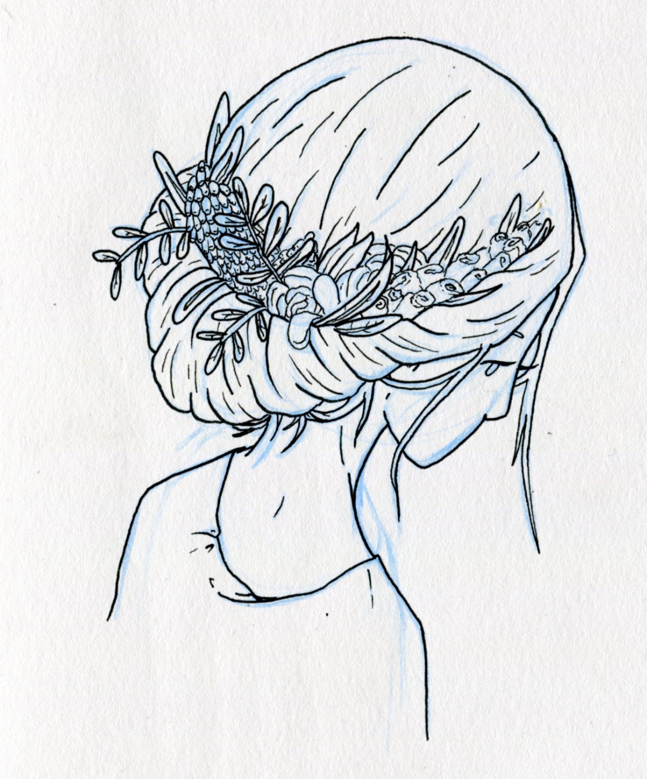
Bouquet
This week's word was bouquet and as I didn't want to draw a bunch of flowers I looked on pinterest for inspiration (like always) and I found a lovely photo of a girl with flowers in her hair. I got a bunch of reference for this idea and then drew my own. I stole the colours for her hair and skin tone from one of my other drawings and I tried a few different colours for the flowers.


Saturday, 31 October 2015
Fiona


My friend Fiona had a birthday recently and as she's the one who's been helping me with Hallmark, I decided that she should be one of my character portraits so I can give it to her as a present. It was much harder to draw her as the past few times I've done these I've been with the person I've been drawing and have been able to get first hand reference. When I can't do that I turn to photo's on Facebook but Fiona only has 3 or 4 so I had to really try and capture the things that I remember about her and her face shape and smile lines. Hopefully she'll like it and it'll be an accurate illustration of her.
Athas
So as I'd mentioned before, I'd like to do some of my character portraits as the staff of Athas (the coffee shop I frequent) and since I've gone down there three times this week for cop reading I've also managed to get some good progress in this. This is mainly because my brain gives out after about two hours of notes and quotes but also because I managed to ask one of them if she'd be okay if I drew her. This made me feel a lot better as she was pretty positive about it (I feel like less of a creep now). after getting her approval I decided to go forward with lee (though apparently she spells it with an i so li? I'll have to ask how to spell everyone's names) and after showing her the sketch version, she was also really positive. Everyone who saw it recognised it as her without me having to tell them and I was told that the stance was just like hers. This made me really happy as its the more subtle aspects like this that I'm wanting to get down. Though Lauren has since told me that her tea towel in the apron pocket looks like a baby's coming out so I'll probably have to change the colour of that before I print. With renewed confidence I did some sketches of Sarah but didn't finish them, though I have been thinking that it'd be good to draw her with her hands covering her face as she seems to do this for every photo they put up to Instagram and it'd be good to continue the them for the exhibition. I then did a sketch of Joel that was pretty decent and as I'm bad at drawing men I decided to improve that one and use it as the one to be penned and coloured. There were a couple of tweaks I had to make in photoshop, like the hairline and his bun but I think the end result is pretty good. I'm particularly pleased with the beard as I don't think I've actually done a beard before and it took some work. I wanted to do an oval around him instead of them all having a rectangle but this was a lot more difficult to do and may need reworking before I print them for the exhibition. By the third day I was there word had got around that I was drawing them and I received quite a lot of positive views about it to various extents. Though as every member of staff seems to know now it seems I'll have to draw all of them instead of just a few. It seems really harsh now to pick and choose who I draw from the staff, so I guess I'll draw less other people or it'll be a really big brief.
Tuesday, 27 October 2015
Adventure
I had to do this weeks word pretty quickly as I need to focus on cop but I think, aside from it being a bit more rushed than normal, it's pretty good. I think its the colours that bring it together, particularly the shrubs on the cliffside/mountainside.
Saturday, 24 October 2015
Stuffed
For this weeks word I drew a little girl holding the stuffed toy I had as a child. The hair is based on a photo of my aunt I saw and you can see my doodles of this idea on my sheet of doodles for my children's book character.


Song of the Sea
Last night I watched this beautiful film, it covered a lot of themes that I was interested in for my children's book and has helped me think more about where I want my book to go and has been very inspirational both visually and for storytelling.


Dens
http://www.theguardian.com/childrens-books-site/2015/may/11/secret-hideouts-the-best-dens-in-childrens-books
Another article I found while looking at cop sources, I think I'd like to bring in dens to my children's book as they were so important to me as a child and I think they should be shown more often. I was thinking that she could build herself a den on the turtle island and stay there for "months" while they journey and then make it home in time for tea.
Another article I found while looking at cop sources, I think I'd like to bring in dens to my children's book as they were so important to me as a child and I think they should be shown more often. I was thinking that she could build herself a den on the turtle island and stay there for "months" while they journey and then make it home in time for tea.
Girls in trousers
http://www.theguardian.com/childrens-books-site/2015/jun/15/childrens-books-girls-in-trousers
I found this article while looking for some cop material, I just thought it tied in with what I was doing anyway. Though it seems that dungerees get worn more often than flat out trousers but I think they still count as not being overly girly.
I found this article while looking for some cop material, I just thought it tied in with what I was doing anyway. Though it seems that dungerees get worn more often than flat out trousers but I think they still count as not being overly girly.
Colour tests
I drew up a proper version of my doodles to do these colour tests. I think I've reached what her colours should be as I want this to be more of a Autumn/Winter book. I got all the colours on the side so I could text several different ones that I was interested in trying. Also I seem to have made the issuu document backwards but I'm sure you can still tell what I was doing. I think I should talk to Zara again about how to do freckles properly, as hers are always really good.
Character doodles
While writing notes for several other briefs/modules I've been background thinking and doodling about my children's book. She's pretty autumn based and dresses a lot like me but with a big comfy scarf that covers half of her face. I've also been thinking about having a moving island that is a great sea turtle. I'm not sure if he's a small part or a large part yet but I'm trying to be background thinking abut it until I can fully concentrate on it later. The bottom page also features some notes on what I should do/consider in 603.


Lee
While sat in Atha's doing some reading for cop I started doing some sketches of one of the barista's as I'd really like to do one of her. I had been thinking that it would be really nice to have some of these characters to be from Atha's so that my mini exhibition could be Atha's in Atha's. However I felt guilty drawing this as I didn't have permission and I'm not as close to her as I am the other people I'm drawing. I think I'm going to go ask the people if I can do a drawing of them for it and if they'd be comfortable being up in their place of work. Or I could just do friends and family and not feel like such a creepy obsessive, this would also mean that non-Atha's people could be up in the exhibition.

Monday, 19 October 2015
children's book
Follow Rosie's board Big kahuna on Pinterest.
I'm vaguely thinking that I would like my children,s book to be set in cornwall or somewhere similar. I've also been thinking about it maybe having a disappearing island plot line but I'm not quite sure yet.
Star
This weeks word was star and after doing more doodles where I wasn't quite sure what I was doing, I saw a photo on reddit of a tent view. It gave me the idea of making this and I then went on pinterest for some reference. It was a fairly quick drawing and unfortunately you can tell in a couple of places. As I've been working with a limited colour palette on my traveling man project I thought I'd try it for this one as well and while you mightn't be able to tell that that's what it is but I think it worked quite well. I rather ran out of time on this one and I had to do my shading much quicker than I would've liked, this is visible as I only used the one colour to shade with and it doesn't really work on the grey.
Fantasy background reference
Follow Rosie's board Fantasy background reference on Pinterest.
So far I've been looking at this type of fantasy reference that has a ethereal theme but so far there is no line work which is part of my work so I'll have to think of how to combine them.
Becky
This is my illustration of Becky, I posted the line work this already. I think I've actually managed to draw her pretty recognisably and I'm very proud of the hair fade (informed by ink). The other thing that's new to this is that I started using a wacom from when I was on the shading stage and the lines of her t shirt are drawn from that. However I think this could be improved as while accurate the arm looks a little odd, even after I widened it a little and the baggy part of the top on her drawing arm side mainly looks like she has lopsided boobs.

Wacom
Hollie did me a great favour by practically forcing me to try a wacom again, I've had a grudge against them for a long time as it's felt like I needed to learn how to draw again. I drew this free hand which and its kind of terrible but I'm not very good at drawing without sketching first anyway. I discovered every thing that I'd been doing with a mouse before (mainly colouring and shading) was pretty much the same if not easier ( shading is easier for sure) and from now on I'm going to use a wacom regularly.

Ink
last weeks word was ink so after doing some doodling of what I can do, I settled on this idea. From there I drew her in dip pen and ink, as it seemed fitting. I also made some coloured ink pages to work with. I then put them together on photoshop which required some moving about and perspective changes. I also had to learn how to do the proper fade, which Hollie taught me how to use and has come in useful since. I posted this to my professional social media accounts as well and it got more attention than any other of my illustrations. I think this is because of the clear concept and the contrast between such bright ink and the lack of colour elsewhere. Personally I think it could still use work, the start of the fade is still visible if you know where to look and I'm not a big fan of the paper texture where the ink isn't on it but I still don't know how I could remove it without ruining the ink.
Saturday, 17 October 2015
Statement of intent
This is what I have so far for my statement of intent, I'm not quite sure if this is right but if I'm still not sure after tomorrows work shop I'll ask to have a chat with Fred.


Monday, 5 October 2015
6 Briefs
Macmillan Prize:
This year I would really like to enter the Macmillan Prize. As its a competition for creating a children's book I think it would be the most useful to my practice and as its a students only competition this will be my last year to try. This is a competition that I have been excited to enter since I first heard about it 3 or 4 years ago and would like to put a lot of my focus on to hopefully produce a good book. I've put the brief below.

Illustration Friday:
For one of my live/competition briefs I'd like to do an Illustration Friday every week or every other week depending on how busy I am. Illustration Friday was one of my favourite parts of Responsive last year and this year I'd like to make it into a substantial brief that I can continue to be working on all year. As the year goes on I am most likely to get stressed about a great many things but IllFri was something I always enjoyed doing and has a quick turnover. so I'm hoping to keep a brief that'll keep the joy in creating while I get stressed. It also is good practice that I won't be able to sit on anything for more than a week.
D&AD/YCN:
I'd also like to do a D&AD or YCN as they have good briefs and good exposure. I'm hoping there will be another children's book one I can do but I can't see what there is yet. If there are no book illustration briefs I think I'll do the penguin brief but I'm not sure if that would be substantial enough. I'll need advice on this brief in particular.
Backgrounds:
I have spent too long ignoring the backgrounds in my work and focusing on individual characters, in level 6 I'd like to change this and do a brief dedicated to them. I'm proposing doing 3-5 illustrations for 3 certain types of background (city/town, forrest/nature, fantasy/sci-fi etc.). While this might sound a little vague I think this is one of the things that I really need to do to improve my work, particularly in preparation for creating another children's book as my last one had a clear difference in the skill, when it came to my characters compared to my backgrounds. I also think some scenes without characters would be good for my portfolio and would be applicable to a great range of practices.
Character/portraits:
This brief, like the last, is mostly for furthering my skills and creating lovely portfolio work. However it also is a direction that I stated moving towards in the summer when I created a few different pieces for friends and family and is something I am interested in investigating further. I find it incredibly interesting to take what you know about someone and to try and convey that while also re-imagining them into a character. I would like to create 10 - 20 illustration of people I know and interact with on a regular basis. If possible it would be best to have each illustration be tied to a story they've told me but I'd also be happy with getting their personality into the character. I've also been thinking about how the coffee shop I draw in a lot puts up artists work and if I could put my work up there then I would quite like to do a mini exhibition of this, preferably with the portraits being of those who work there but I'm not sure yet.
The sculptors daughter:
For my cop research I started reading and making sketches of the sculptors daughter (see cop blog) by Tove Jansson. It's a slightly altered story view of her childhood seen through the child's eyes and mindset. This book has the most beautiful imagery that I really wanted to illustrate and I think it could make a good brief and good practice to illustrate a more grown up book. I would like to create at least one illustration for each story within the book and a wrap around cover. I think it would be good for my portfolio to show that while children's book illustration is my focus I don't only illustrate picture books.
Analog
I started following someone on Instagram who works in dip pen and inks, her work is so beautiful it really made me want to go back to analog. So I created this using a mix of dip pen, ink and Promarkers. I'm really happy with her, she's loosely based on the illustration word of the week which was nature but I never actually submitted her. One thing I would do differently though would be to do the plant lines after the ink as the green circle faded the plant line significantly. it seems obvious to do it that way but I wanted to be able to rub out all the pencil lines before I put any of the proper ink down.
Underwater comic
This is the only comic idea that got to the inking stage but I's my favourite. It's a personal comic about processing my own feelings and about how nice it'd would be to be able to take a little break. I think I've managed to get the calmness that I was looking for and it has the right amount of detail for what I want in my work.Some of the lines could be better but overall I'm pretty pleased with it and hope to have the time to finish it some time soon.
Sketch dump
To me this sketchbook work from the second half of my summer seem to show a vast leap from earlier. I'm not sure what changed exactly but there seems to be a bigger improvement in most things (drawing men, drawing people in general, comics, fantasy characters etc.). It's from this that I got the idea for a portrait brief as I realised how many people I've been drawing and how good it's been for my practice.
Land of the Scots
During the summer I went up to the Edinburgh Festival and to see my sister who lives in Glasgow. It was a great experience, it also made me more comfortable talking to strangers as everyone wanted to chat (mainly to get you to their shows). I was also better at talking to people my sisters introduced me to. I did some travel sketches and learnt that I'm terrible at drawing straight with a pen but it got the ideas down. I also did a drawing of my sister which I managed to get pretty close to how she looks and got some extra practice with glasses. Which is especially good as I'd been trying to draw glasses at the start of the year.
Wednesday, 30 September 2015
Fish plan
Nearly everyday in the summer I walked by the canal and got a really serene contented feeling. I found it really calming and by looking a little longer in the water I managed to see quite a lot of wildlife, this made me really happy and these are the plans for a multi layer drawing of what I saw, I'd really like to get back to this and hopefully make a big print of it.
Tuesday, 29 September 2015
Finished drawings
These are two finished drawings that I did about the end of of july. The first is about how I've got really into a hip hop musician called Milo, to me he really sums up that feeling of melancholy perfectly and in this drawing I was just trying to capture the feeling I get when listening to him. Its also a first that I've done two toned hair which I think has come out well, I also used darker colours than usual to continue along the theme I'd started.
In the second drawing I've created more of a character which was really fun as I've not been making as many recently, this would be something I'd quite like to get back into. It was really interesting to use the colour that is her skin tone without using lines to shape out where it goes, I think I'll use this more often in the future for similar things that shouldn't have too much definition. I had to make another pattern for this and I think it's my best so far, it seems I'm improving each time I make one.
sketch dump
These are all the sketches that I started doing at the start of the summer there are some nice progression ones and some ideas for later in there but also some brain fart ones.
Thursday, 14 May 2015
Wednesday, 13 May 2015
Full book including storyboard
This is my full book including the pages I had storyboarded. I think it works well and I would really like to finish the entire book at some point. However seeing it full has made me realise that it looks a bit like she commits suicide. I don't really know what I can do about this right now except to remind myself that Tiff is shown standing on a star so maybe it won't be the thing people think of.
Presentation boards base

This is the base I made for my presentation boards, the pattern is made from the colour variations of tiff. I think it's a little garish for me but I do quite like it for the book and if I had more time I could have mocked up some notebooks with this pattern.
Tuesday, 12 May 2015
Mockups
These are all the mockups I made I think the Ipad/phone ones are best as the show the book the best but I also think the T-shirts worked quite well. However I really don't like the mug it was a lot harder to do than I expected and the template I was working from wouldn't let me change the colour of the mug so I think it looks shoddy. I'll have to spend more time practicing if I want to mock up a mug in the future.
Stickers

I've designed some stickers to go with my book or rather I collected my favourites from my coloured pages to make a sticker sheet. I'm very excited about these as I've never made stickers before.
Moon

I added a moon to my front cover as I thought it tied it in a bit better with the rest of the book.
Mockups


These are the first mock ups I've ever done and I'm very pleased with them. I found a website that provides free templates so I only had to put my work on them which was a lot more manageable than fully creating the mock up. for these I took a screenshot of my book issuu so it'd have the same digital bend of the pages that an e-book would.
Wrap around cover
At first I tried using the map as the front cover Like I had imagined. I though it'd look really good at an angle with it folding over onto the back cover as well but in practicality it was just awkward and wrong. I also tried it as the full cover but as I wanted the girl and tiff on the cover it also didn't work. It did work better without the map background but it was still too busy so I went away and looked at some book covers. I saw one with a circle in the centre and it inspired me to make my chosen cover. I tried using flying eye books as the proposed publisher, I got their logo and looked at some of their books (all of them had the name at the bottom of the front cover and the logo on the back). I don't think it works as well though so I also tried walker books which I think fit in perfectly. I tried a few different colours for the cover but I ended up with the one I liked first as I think it compliments the characters best.
Map
I finally got the perspective to make sense. I also created one with colour and texture to use for the front cover, though I was thinking of using the mono one as end pages. I made an alternative one with lines but I think it makes it look too busy and the black fill isn't perfect but it's the closest I've got to what I had in mind. Next time I think I'll do it all with a dip pen and ink, including the fill.
Tiff gif

My notes on it.

What happened when we tried to liquify it.
After going over and seeing paul's animation he tried to show me how to make one too. It didn't really work very well but I do like what came out of it and it made me happier to try gifs again in the future.
Cliff
Now that I've coloured my characters its super quick to colour her again. For the sky I started with the colour from the moonlight sky and kept lightening it as I went down. After Eleanor said she couldn't tell wat was happening with her face I tried amending it but it just didn't work at all, so for next tiem I'll have to make sure not to draw her mouth so weird.
Moonlight

Here is the moonlight page with Tiff in as well. I think he adds a lot and he fills a space that was a little blank before. unfortunately as he was added later I had to twist him a bit for him to look at her and I think it looks a little unnatural.
Tiff
I digitally coloured my creature character, while I did play with some other colours I ended up choosing similar colors to the original. Everyone still thinks he's a fox. I drew the two new ones for my moonlight page the better one is to go on the page with the girl and the other less detailed one is for the text page. I really like the one I did for the moonlight page and I think those little lines that that one has really make a difference, particularly as I then shade under the lines which add a little extra definition. I also named him Tiff after the name of the files that my scans kept coming up as, I mainly just thought it suited him.
Sandwich

This is by far my favourite, it has very satisfyingly worked exactly how I wanted it to. I'm sure the perspective is wrong in places or entirely but it doesn't really detract from the drawing. I think that this has worked so well because of the shading, particularly the overlapping shadows.
Coat
After I finished the stars i moved on to the coat page. I tried using a texture in this one as well (the lining of my coat, which is the same as hers) but it just looks like a photograph on top of a drawing which I really don't like. I'll need to spend more time learning how to that properly before I try again. I also looked into changing the background colour to more of a beige like where's my hat but it looked too much like the sandwich and besides I think I'd prefer it to get its colour from the paper its printed on rather than printing a beige colour onto an already kind of beige paper.
Moonlight progression
I did try using a texture for the stars once though, this one is from a photo I took of mould growing in my old house that I thought would make a good starry sky. It does make a good starry sky but I think its too busy to go with the rest of the book so I've made the stars how I normally would. I also tried to make a gradient for it but that ended up being more complicated than I thought ,particularly with how I had made the stars. I think if I'm going to do a gradient I need to make sure I have the time to actually learn how to use it correctly.
Texture
I made these textures to use in my book. I was mainly thinking for the stars and how to make it more magical but my lack of skill with wet media made them subpar and I didn't like the idea of having some of them with texture in and the other pages without.
Kitchen
As I mentioned earlier perspective is not my friend. I wanted to show her preparing her supplies for her walk, like the coat drawing says,but I found it incredibly difficult to actually draw the kitchen she's meant to be stood in. I hardly ever draw backgrounds for my illustrations as I like to keep them simple but surprisingly not drawing backgrounds often has made it a lot harder and more time consuming to do the backgrounds than it should be. One of these is even based of my kitchen at home but my kitchen is too small to work right for this.
Linework
I made some more finished linework based off the newest storyboard. I'm most proud of the sandwich as I wasn't sure how the layered effect would work but I think it makes it look a lot stronger. I'm least proud of the rained on girl as I think she lacks who she is compared to the other drawings but then it would make sense for a drenched girl to feel a little flat.
Storyboard
This is my new storyboard I made with the layout in mind. I realised my favourite books had smaller, less detailed illustrations on the side where the text is, so I decided to try to do that for my book. some of the pages in this are alternate versions of the same part as some of them needed more amending than others. I have however managed to draw the creature character in more of these than I did in the previous storyboard.
Book layout research
As I had got excited about the other pages, I realised that I wasn't sure about how I wanted my book to be and what layout it'll have. So I looked at my collection of favourite children's books to research how they've laid out their books.
Initial colouring


This is the initial colouring and so far I think its working really well and I'm excited to do the others, however I've not tried the background yet and that is where it'll get difficult.
Thursday, 30 April 2015
Evaluation
In The work I have produced I feel that this project has gone well. I have made work to a higher standard then I ever have before. I have also successfully collaborated with another illustrator. In the past when we were teamed up I hated it and wanted to never work someone else again. However from working with someone with a similar thought process to mine I found the experience enjoyable, though still in need of work. As Rowena and I do have such a similar thought process we were often late at the same time or had forgotten to do the same things, which meant that we often failed at the same aspects of our project rather than having someone else to pick up the slack. Though saying that when we would realise that we'd both forgotten we were very good at working together to fix the problem. I feel that my creative process has improved immensely from this project as the short time frames I had to work to allowed me to just focus on it and get it done. from this I think my work is a lot better. without a brief dragging on I still have the motivation for it, rather than having to try to be excited about something that has dragged on for months. I do feel however as I had so much other work to be doing that had more pressing deadlines I wold completely forget to do the work for this module. This meant that 90% or so of this module has been completed in two to three weeks. I feel that if it had been shorter and more pressing I could have just got it done rather than thinking about how I've got ages to complete it. This idea of a vast amount of time provides a comfort blanket of not having to work on yet, especially when you've got so much other work to be focusing on. I was also very ill and unable to do my work when I needed to most and while I definitely think that if I had done my work correctly and to the right scale it wouldn't have been as devastating, I also think that I at least need more studio time to just be getting on with work. I find that if I spend the entire day in sessions and workshops I'm too tired to start getting on with my work at four and just want to go home. After saying a that though I really do feel that this project has been worth while and has improved my work to a degree that I am proud of these and feel that I now have some work I could put into a portfolio. As previous work has been more about the process rather than the end product I have been dramatically lacking in any work I would like to present to people.
I need to learn from this experience and focus more on my time management, I have known that it is my major issue for a long time but I will have to put more of a conscious effort into keeping track of everything I have to be doing and to make sure I've not unnecessarily given myself too much work in too short a time frame.
I need to learn from this experience and focus more on my time management, I have known that it is my major issue for a long time but I will have to put more of a conscious effort into keeping track of everything I have to be doing and to make sure I've not unnecessarily given myself too much work in too short a time frame.
Wednesday, 29 April 2015
Offlife
I was running out of live competitions to enter when I talked to Rowena and she told me about Offlife and at this i remembered a three panel sketch I did when I was thinking about doing the we transfer brief by myself. I used this as a stating point to make what I believe is my first comic and apparently they can take a long time to do as this took over twelve hours to do. However those last two hours were my own fault as I started the comic before properly looking at the submission details, so I'd drawn the final frame as a long one to show the depths. THis meant that i had to painstakingly move, resize, add some extras and change the background over and over again until it fit. Though after doing all this and getting heavily frustrated with it and myself, I really love the outcome and for now at least I'm proud. If I was going to change something I think I would spend longer on the background colour to make sure that flows correctly. I think I'd also look into some more creatures for the the wider one as I liked them better a bit more squished together. I'm not sure I regret working to the wrong format though as I like the long version better for the flow of imagery.
Monday, 27 April 2015
Hii 2


I originally drew this as a possible comic about being sick but I'm not great at comics and it sort of fell apart but as I liked the drawing I thought I'd finish it off for a Hii Illustration submission. This became one of my favourite illustrations (that I've done) as I feel that everything works. The drawing doesn't have any obvious mistakes, the colouring has both pale, weak colours for being ill while also being lovely and spring like, and it has the stronger pink and brown colouring to stand out. There's also a pattern on the duvet that I made digitally (a first). However as much as I love this illustration I was unable to actually submit it as the error from last time persisted and didn't go through this time.
Hiii Illustration
Hiii Illustration competition was just wanting any illustration made in this year, which I found harder to work to as there wasn't really anywhere to start from but after looking at Pinterest I saw some summer shorts (the ones in the drawing) and as I was still feverish at the time I was drawing this I had lifted my hand to my head which immediately made me think of this pose. The rest of it came from me thinking of my ginger friend in the summer as she tans/burns and freckles all at the same time. While I found the colouring of the girl really simple I had a lot of trouble with the rest as I knew I wanted it to be summery but didn't know how to put these pale summery colours together and I wasn't sure if I should do the baking tools as bright vibrant colours like they often are or to make them more subdued. In the end after using coolors a lot I managed to settle on varying blues for the baking stuff and the background. With a green and yellow for the clothes. After spending so much time colouring it I finally got to submitting it and found that Hiii is clearly in another language that's been translated as all of the instructions made no sense and I had guess at what goes where. After getting over that hurdle an error page kept coming up when I actually tried to submit but eventually it went through, much to my relief.
Useless pet
Like with the previous one (as I drew them at the same time) I treated it as word association and the thing I thought of as the most useless in the world (something not in my house but widely known) was a pet rock. This was relatively quick to do but when I had finished colouring I thought it still looked a little flat. So I got a photo I took of the mold growing in my old house (originally taken because I thought if I inverted it, it would make a star effect) and inverted it and applied it as texture. While I'm not overly proud of this drawing I am pleased with how the texture turned out and it has taught me that I should try using textures more often.
Useless
I treated this one more like an Illustration Friday, using word association to quickly come up with a concept (or in this case two). I did this based of what came to mind as the most useless object I would still have in my house and i came up with a bulb with the filament broken. which sounds really dull but I do always end up with broken bulbs that I'm not sure how to recycle and thought that maybe others would too. However when it came to the digital side (which went really well) I realised that just a bulb is a little dull so I added an expression to turn a regular bulb into character. When adding it to the template I found that I had a bunch of the paler colouring outside of the lines that I just hadn't been able to see on the white background. So I had to rather complicatedly erase all the edges as I couldn't tell in their unmerged appearance where had gone over and where hadn't.
Aviation
This is the first Threadless that I did and it was the longest to do as I put a lot more detail into this than I usually do. I don't have a lot of interest in aviation (which was the category I had to do) and I can't really do or enjoy technical drawings like you would do for a plane but flying pigs were mentioned in the suggestions and I really like them particularly since I heard John Steinbeck's motto Ad astra per alas porci (to the stars on the wings of a pig). Bu as it was in the suggestions and really overdone anyway I wanted to find a way of doing it with some originality. So I drew it as a wild boar piglet (one of the cutest things in the world) and the wings are based of a picture of a bee-eater. To create the pattern on the wing I looked at where the bee-eater has markings and then tried placing similar ones where they would work with the existing pig. To show the different markings on the pig I drew lots of little line details. From there I was able to do the surprisingly complicated colouring of all the markings. All of the colouring was quite difficult as I had to find the right colour to show the wild boar piglet, which if you look at the photo has around 60 different colours to create the over all effect. It was tricky to find that base colour as if you did it too dark it took all the cuteness away and too light just didn't make sense. After finding the correct colours for this (with much tinkering) I had to learn how to do it in a mock up for the submission requirements. It gave out a template and though it took me a while to figure out I think it looks really good on the t-shirt.
While I have been forgetting to save them to a board on Pinterest, I have been using it to work on nearly everything and have found it an invaluable tool. It allows you to quickly see beautiful visually rich imagery which can lead to all sorts of inspiration.
Window
Like with the first one I just typed window into Pinterest to see if it would give me any ideas. I found the window that the shape is based off and thought about how much I like to read at the window, so I increased the size of the ledge and drew a girl reading on it. I messed up the face a little in the drawing so I drew an alternative but I managed to fix the original in the digital section. I've really loved doing these as I've been able to be more creative and with only having a short amount of time I've been doing them while I'm still interested rather than some of the long briefs where I can get quite demotivated as it progresses.
Strong
This time the word strong made me think of how calcium makes your bones strong (I guess advertising really does get in your head). so I drew a skeleton drinking milk and while this was purely coincidence I really like the way the hole in the pelvis looks a bit like a heart. I then thought that a pale blue would go best and to keep it as simple as possible.
Path
This is the first of the Illustration Friday that I submitted and I really enjoyed making it. As it was just for Illustration Friday I was able to just do what I wanted without having to worry too much or over think it. With such a short turnover (a week) there isn't really time to spend too long questioning what I'm going to do and I just got on with it. As it's essentially word association I just typed into this weeks word into Pinterest and found some really good reference material straight away. I took the path layout and the forrest placement from one of these images and then did them in the colours I wanted. I also really liked the idea of having a character facing the path as if facing a choice.
Illustration friday


These are sketches I drew for Illustration friday (passion and jagged) unfortunately however I never finished these before the submission went past meaning they were useless to me but I'm not really that annoyed that I didn't keep track properly as I don't feel that any of these were really strong enough to make into illustrations.
Presentation boards
These are the final 4 boards, as you can see they look different to my previous post as Rowena made hers look much neater and more visually interesting. to ensure that our boards all matched I handed my finished boards to Rowena and she converted what I had done to the same style as hers. We were also very lucky with our boards as the D&AD deadline was extended by a day and we were able to spend a more appropriate amount of time making them then we had before.
Boards
For the boards that we had to do for hand in, we decided to do 2 boards each and I made us a set board for everything to be placed on so we'd have a sense of professionalism and consistency.
Final print

This is the final print and I'm really happy with it I think both of our inputs work really well though like with the last one i worry they are a bit too separate and would have liked to have made them more whole.
Subscribe to:
Comments (Atom)