Thursday, 19 May 2016


Wednesday, 18 May 2016
Summative Statement
My brief was to illustrate at least 10 deep sea creatures that could be collected into a book and to design a front cover for the book. My main focus has been on capturing the ethereal quality of the creatures and that they should be both accurate and stylised. I have also put a lot of focus on how to draw the different levels of opacity and luminosity.
Promo & Merch mock up
As my front cover came from my deep sea pattern I was able to use it to apply to some promotional material for the book. I really like that whatever merch you'd look at connected to my book, would instantly bring you back to the front cover. I think the line drawing versions work best though and get again it is something that I wish I'd had the time to screen print for the submission.
Double page spreads
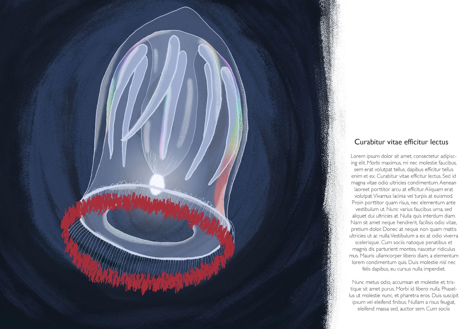
These are the double page spreads I designed I used the same method as with the last post but they didn't sit int he issue document with the others well. The two with the white edge are my favourite as it brings out their highlights but I do like having at least one page that shows the total gloom.


Single page spreads
I took a lot of my reference on how to plan this layout from those books, it's set out to be more factual and educational, while still being about the images themselves. I had been aiming to get the facts together but I found that a lot of the time, the reference I had been using was all image no info and that the documentary's I've been watching (like the blue planet) can be incredibly vague. Saying things like "as the comb jelly swims past ..." what kind of comb jelly? I wasted a lot of time I didn't have on this so I reverted back to the lorem ipsum I used with sculptors daughter. This allowed me to just show how I want it look without wasting any more time but next time I'm going to be getting all the facts and then drawing them as it just doesn't work the other way around, or at least not easily.
Book research
When it came to doing the book layout I went to the library I grabbed these books to be able to see how other people have approached showing deep sea fish in the same context. I included the last one too even though it is the more childish of them as it would be interesting to make one like that for kids but that particular one is ugly so I won't be getting my layout form that. I think I'll be using the deep one as my main reference as the blue planets one is much more about the text than the image and the textures one is all about the image.
Book mock up
I mocked it up onto a book and it looks really good, the pattern fits to the edges without being too tight (though it gets a bit close) and the background really brings it together as finalised image. It would be a good idea though to make sure that I put the text a bit further up next time as it's almost falling of the edge of the book.


Book Cover
As I'd spent so much time focusing on how to accurately draw the marine life while keeping and improving my tone of voice, I left the cover much too late. However I was able to pull the main composition from my deep sea pattern and rework it to make a book cover I'm really happy with. It fits the space wonderfully and it flows from the top down to the title. I did make it a new background and played around with some different gradients as well as having to put a a quick spine together for the mock up.
New fishes
I coloured some of the creatures I had already drawn but I had over estimated how fast I could get through them and only managed to finish three of them. I did however get to improve my process on the jelly with the red fringe. As it has such a reflective sheen on it, I was worried about how to get the rainbow shine as when I tried to create the same look on the blood belly comb jelly I did for secret 7 and that didn't go well. However I found out that If I use the rainbow gradient and the white highlights but then turn the opacity way down and use a textured brush over it I can combat the MS word art effect that it normally has. I also started using the different shades background that I started in brief 1 and I realised that I could use the highlight tones to simulate the glow in the background as well as in the creature. I did try using my new favourite brush to shade on the angler too but it just looked a bit dirty, even with a very low opacity layer over it. The pale lines also didn't really work either but I'm going to still work on my pale lines as I think they still have potential.
terrible cute fish
This is a sketch of the incredibly cute fish at the bottom, but as you can see I had to give up on it as I was butchering it. I've found that frequently the cuter the fish is the harder it is to get right. I think it's linked to the soft curves that don't easily translate or that there's less lines, I'm not sure but I definitely need to put more work into it.


Summative statement
This brief was about responding to a word with total freedom as long as I did it within the week before the next word was released. The aim of this was so that I could react to something not from myself and something that I had a time limit on as I have the bad habit of not sticking to my self driven deadlines. With this it wasn't up to me and I had to get it done within the week but the freedom in how I responded was to keep me experimenting as I don't I don't think I do that enough any more.
Final Presentation Boards
These are my final boards for this brief, I have tried to keep them consistent across all my briefs.
Punch Applied
I applied the same thing to the proud as punch range but I'm not sure it works as well with these as it did with the other two patterns.

This one seems a little dull with just the pattern on it, I still think that it could be used well but without it's tagline it has a lot less point to it.

I didn't really know if the proud as punch could work in a notebook setting but I like the idea of it being a funny, embarrassing stationary set that a 18-19 year old would be given by their mum when they left to go to uni.

Animal Applied
I wanted to apply my animal one as well and this one is the most versatile but doesn't have that same slogan aspect that can really push it further and make it more interesting.


This pattern could be sold anywhere and applied onto pretty much anything but the brown textured bag makes me think of I it being used to promote being eco friendly and recycling. If I had more time I'd start a range around it.

Smart Applied
Following the proud as punch mockups I wanted to apply my smart pattern to some things. The first that I thought of was that it would make a lovely stationary design. which led to me borrowing Fred's slogan of work smart. I really like this range of work smart, that led to applying it to the shopping bags and creating an expansion of the range that is shop smart. I thought this would work really well for back to school promotion sales but the amount of text made it a little busy. It does work with the sale promotion though but not with the blue lettering. The last expansion I did was the "you're so smart", This one is a little silly but I like that it's a bit of fun and it would make a great congratulations or graduation card.
Summative Statement
My brief for this was to design 2-3 monochrome interior illustrations for 2-3 of the stories in Tove Jansson's Sculptor's Daughter and a full colour cover. I also had a large focus on getting the character looking like a young Tove in my tone of voice.
Lorem Ipsum and Layout
These show my final illustrations in their final layouts. I had left them a little late to do and I had been stressing for a while that I had to type up the stories I was illustrating to create the book layout, which meant that I avoided doing it but then I found out about lorem ipsum, which allowed me to just get on with it without wasting time I didn't have typing up the text. This really helped as I was able to more freely play with the layout, which while I was able to play I decided on the layout I had been thinking of when I was sketching it out. I also made some text only pages to put against the illustrated ones in the mockups.
Print mock up - tried again
I tried again with the plain frame mockup I used on my secret 7 print and it looked so much better than the one with the cactus. The focus is on the illustration and the white border works really well with the pale greens and the white of the text.

Print mock up
I made this mock up as the cover of the book as a print, I think that the image is strong enough to work as a stand alone print. However I don't think it works that well with this mock up. The cactus looks a little lonely, while also drawing focus away from the illustration.

Summative Statement
For this brief I had to design the 7 secret 7" vinyl covers, based only on the music and the lyrics but with a marine theme to create a coherent set.
Summative Statement
This is brief started out as two different ones, the first was to draw people I knew to build up my character skill and the second was to create a children's book character for a children's book I was supposed to be writing. As it became unattainable to create a full children's book and less important to what I wanted to do, I combined them under character investigation. This allows me to focus on improving my skill at drawing characters and think more about how I make them.
Final Presentation Boards
I've added the brief onto the the label at the bottom and a little more information as I got a little feedback saying that it could do with some more.
Thursday, 12 May 2016
Smart
I finally finished the smart pattern that I drew out ages ago. I managed to create the look I wanted before and I used the pink from the brains as a contrast to all the blue. The colours went well but I tried a new way of making patterns (you make a square and then cut it up and put it in the opposite corners) and it didn't quite match up like I wanted. there were little edges that didn't match that I had to smooth over an edit quite a lot.

LIVE FEED!
There's a live feed of exploration of the Mariana Trench! it's where the footage of the new jellyfish comes from and there's loads of really exciting discoveries on it all the time.
Wednesday, 11 May 2016
Presentation boards
I designed the first board to look the same as the first board I made for my character brief to try and create a running theme.
T-Shirt mockups
I loved mocking these crop tops, my designs work really well on them and if I had more time I'd take the white on green ones and screen print them, this would make a lovely limited run collection. However with that said I think the pink jelly on green works best and I would have to make a digital print of that one.
New Dream 3 mockup
I think this mockup works so much better than the one I did first. It's not cluttered with other things so you focus on the print and the white border helps to break up some of the mass of blue.

Print mock ups


At last variations
As I was preparing to mockup some accompanying merchandise, I made two alternatives for my leafy sea dragons. I did this because I felt that they had a lot of detail that wasn't being utilised on the single cover. I also thought that the background they were on wouldn't translate as well onto other products. To fully exploit this I made them the focus and made a new background in the style I've been working in recently. I also made a version that is just the linework in white, as there is a lot going on that isn't immediately noticeable in the coloured version. These work really well to me and I think I might prefer them to the version that is on the cover.


Dream 3 mock up
This is a mockup of the full version of Dream3 but I think in this setting it looks too busy with all the stuff around it and that it lowers the quality of the image as you can't see the details at all.

Vinyl mockups
I made these vinyl mockups for the covers I designed and I think they look ace in context. I hadn't prepared for the stickers so I used sections of the image for them, I actually think this worked really well. The cuttlefish one has been the least successful of the stickers as there wasn't an easy visual to fit the space, like there were with the other ones. I would like to point out how great the humphead parrot one is though as I think it's perfect to go with both the image and the song.
Dream 3
I don't have an accompanying video for this one as I chose the visuals for this based on a photo I found on Pinterest that really captured the ethereal quality of the song.
Art School
I've already talked about why I chose these and how they work with the song but here you can see them in action and you can really tell that they do what the want. This video was also my main reference for the cover I designed.
Imagine
This one was pretty obvious as well, which I'm wondering was too obvious. I don't think I spent enough time on this song as I've heard it so many times that it wasn't very interesting to do. However the concept is still decent, its about coming together and being one.
Worry
This shows what it's like to be a flying fish that was left behind, this wasn't the footage I was originally looking at for flying fish but when I saw it I thought it really enforced the concept of being left behind.
The less I know the better
Watching how great the video is for this I feel a little like I just jumped on my idea because it fits the title and some of the lyrics but I'm not creating the concept of these based off the video and I still like the idea of it being the sneaky male cuttlefish posing as a girl to get past the alpha male.
At last
This was another really easy one to settle on as it straight away made me think think of the courtship dance that seahorses do. I did move on from seahorses to leafy sea dragons though as I thought they'd be a little more visually interesting and they dance they do is more beautiful. This is another one that works so well to watch together. It would also make a beautiful animation that I might try to create over the summer.
Clearest blue
Presentation boards development
The first board I tried to do was very blank and looked terrible, the layout was wrong and the drawing I did of me wasn't good enough, especially for a first board.

So I added one of the backgrounds from my characters and changed the colours to suit the page more. I'm really pleased with the way the colour works with the lack of skin colour and the blues and greys in the clothing.

So that colour was then obviously too pale for white text so I darkened it just enough to get some more of the text visible, while keeping the colour how I liked it.

Character Pinboard
Veronica and jelly
I've only just started looking at her work, I found her through bearmanbeast and her style seems really varied but once again the sketchbook work can be really rough and expressive which can be totally different to her finished work.


This one below seem to be in a slightly different style to her usual work but it looks quite like the brush that I've been working with and makes me wonder about trying some illustrations with even less analogue lines.

Nick Bear (bearmanbeast)


Also if I mess up my lines I can always put a post it note over it.

Philip Light
I started following this illustrator on instagram called Philip Light, looking at how quickly he can capture the idea and the form of people shows me what I should be doing as an exercise. They don't have to be perfect and they look amazing.
These are observational from a cafe and he's really captured the expressions, personality and stance of the people.

And these below are character drawings based on RuPaul's drag race and as everything on that show is so exaggerated it makes great, quick expressions and outfits. This is an exercise I would like to start doing.

This is a piece of his finished work and it's mainly just here to show that in my sketchbook I should be messy and loose without getting caught up in finishing it.

Tuesday, 10 May 2016
Fiona update
I also gave this the same treatment as the others and it also looks so much better. I did do something different on this one though, when I coloured the lines on the steam I didn't just choose a lighter or darker variation but I coloured it in the ones for the mug and the jumper. This should create a more insubstantial look for the steam.


Joel update and brown lines
I made a little progress with the one colour lines but while it seems to work against the light blue of the shirt and tea towel, it doesn't work against the darker blue of the apron. This also benefits from the new positioning and and textured background. I also think this would work really well as an avocado based illustration as he's in all the right tones. That could lead to a whole range of fruit and veg based characters.


More updates
As I've been putting my boards together and looking at my work I realised that there is a larger difference to the work I made earlier in the year compared to now, to combat this I did some little updates. Mainly it has been colouring the lines and adjusting the shading. However the large difference has been the repositioning, I like having them more off centre and less reliant on being inside the colour to exist and the colouring of the background. I've started to add different shades into the block colour with a textured brush. This both acts as an abstract shading and highlighting as well as making the flat colour on the characters stand out more.


Character sheet
This is my finished character sheet, it is a little more of a final illustration than a normal one would be but I made sure not add any shading to the new additions. I think I have trouble just working roughly, I have described myself as a lazy perfectionist before and I think that does have a large effect on my work. I don't ever want to start it because I know that it'll take me ages to get it to where I want it to be and when it isn't what I want straight away I get frustrated. I'm going to try and work on that.

expressions alternate
I created this as a stand alone from the character sheet, it shows how well the one colour lines can look and I think it would make a good bookmark.

Some coloured lines to think about
These are all coloured lines that I find really interesting and are different to my usual way of working. the first is all one colour rather than individual colours, this would be incredibly faster to do but I still don't know how to get this to fit the whole image rather than just the section in complimentary colours.

While these two have almost contrasting colours that stand out wonderfully, but like with the complimentary ones, I'm still working out how to apply this to a whole illustration.


Subscribe to:
Comments (Atom)